

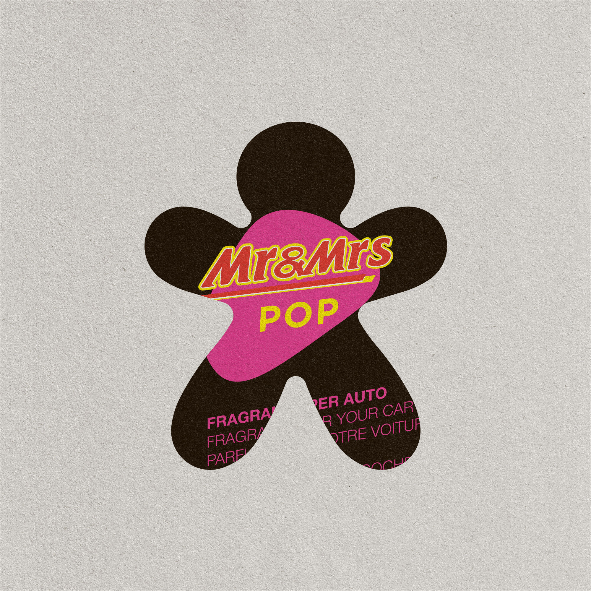
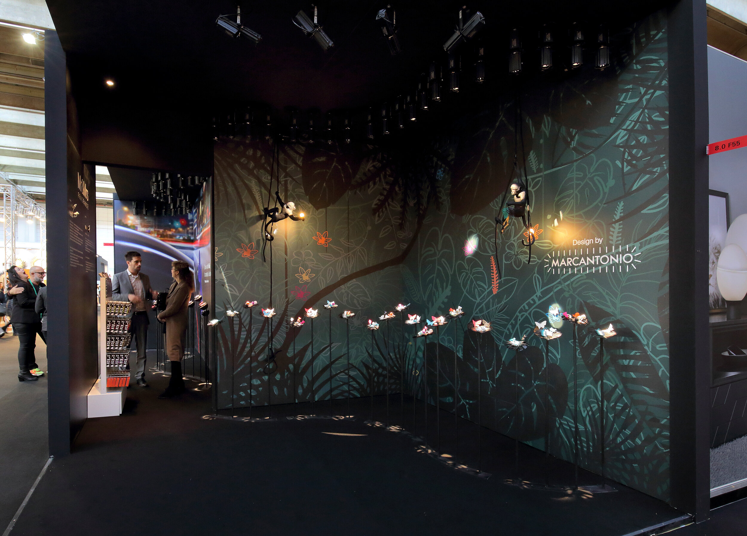
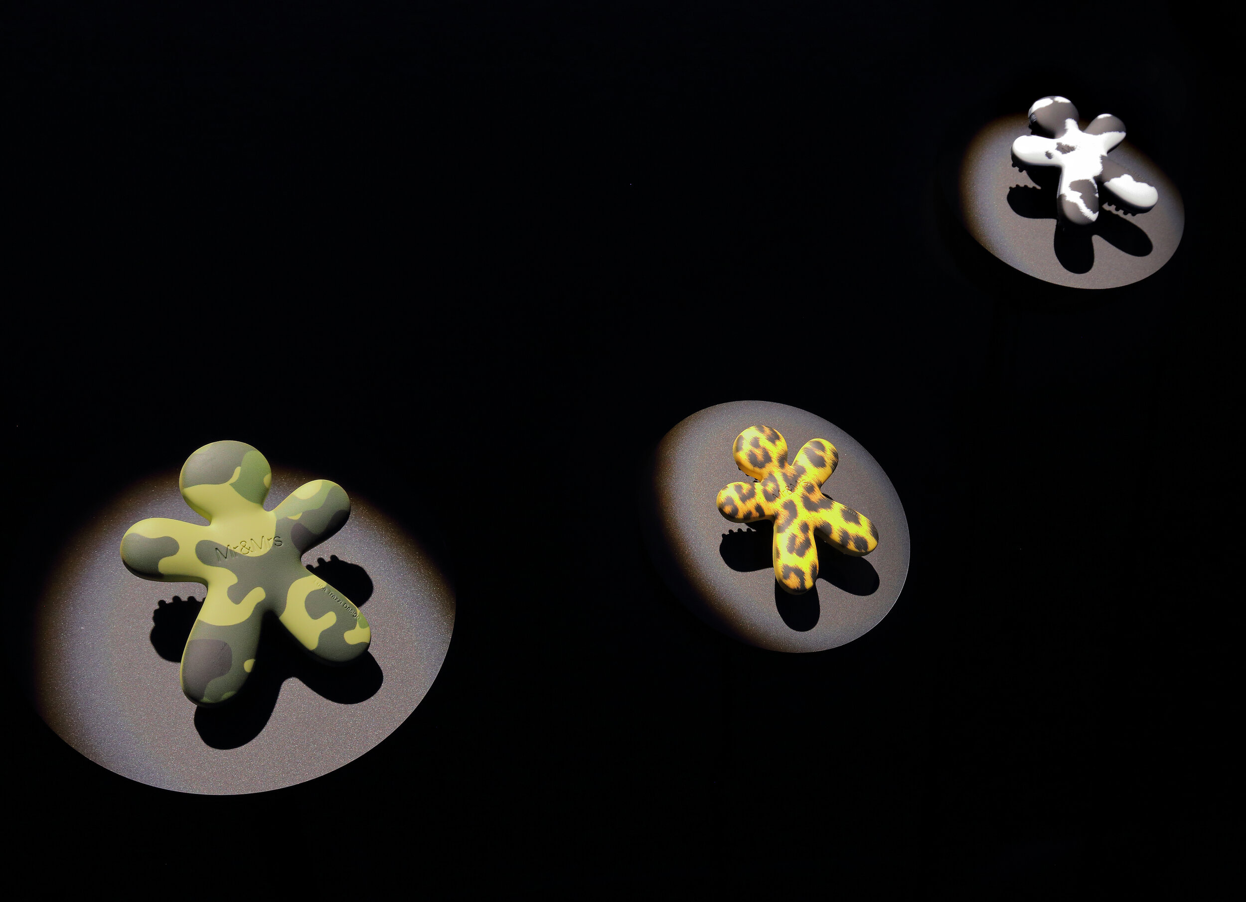
Mr&Mrs Fragrance
BUSTO ARSIZIO (VA)
ART DIRECTION | PACKAGE & GRAPHIC DESIGN
Mr&Mrs create unique fragrance diffusers for cars and for rooms.
Made in Italy and distributed all over the world.
E’ un marchio creato con il desiderio di raccontarsi, di condividere con un pubblico internazionale, curioso e sofisticato, la passione per il design e i ricordi olfattivi raccolti durante le esplorazioni di coloro che hanno dato vita a questa realtà da più di 10 anni.
IN EVIDENCE: PACKAGE DESIGN & PRODUCT STYLING
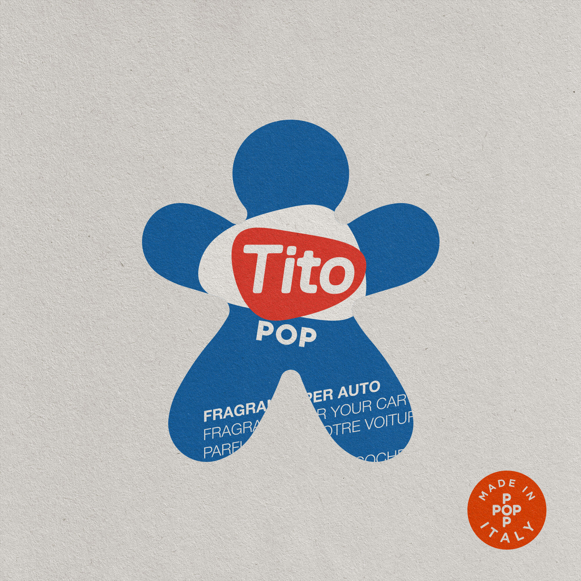
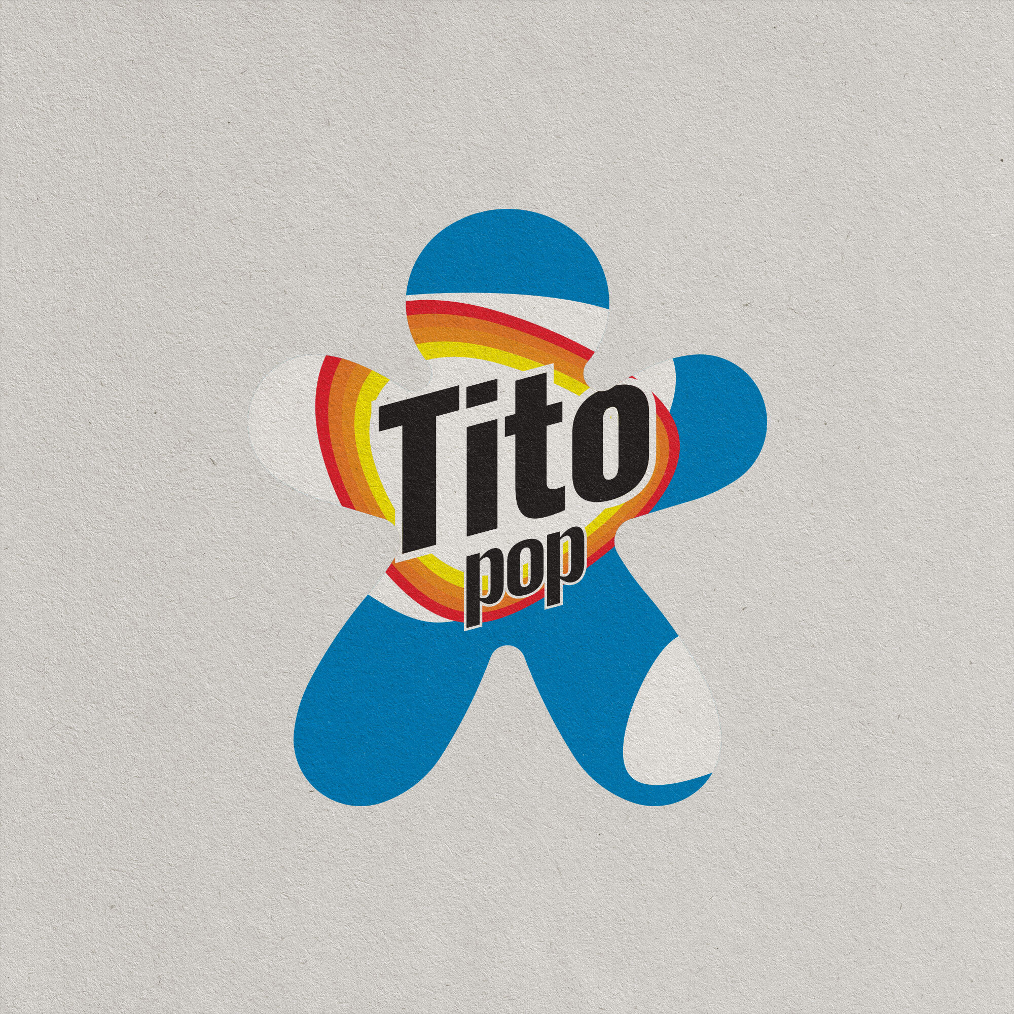
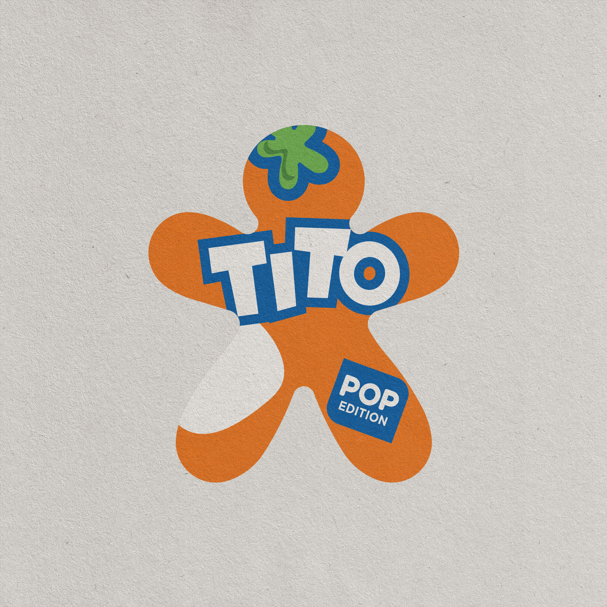
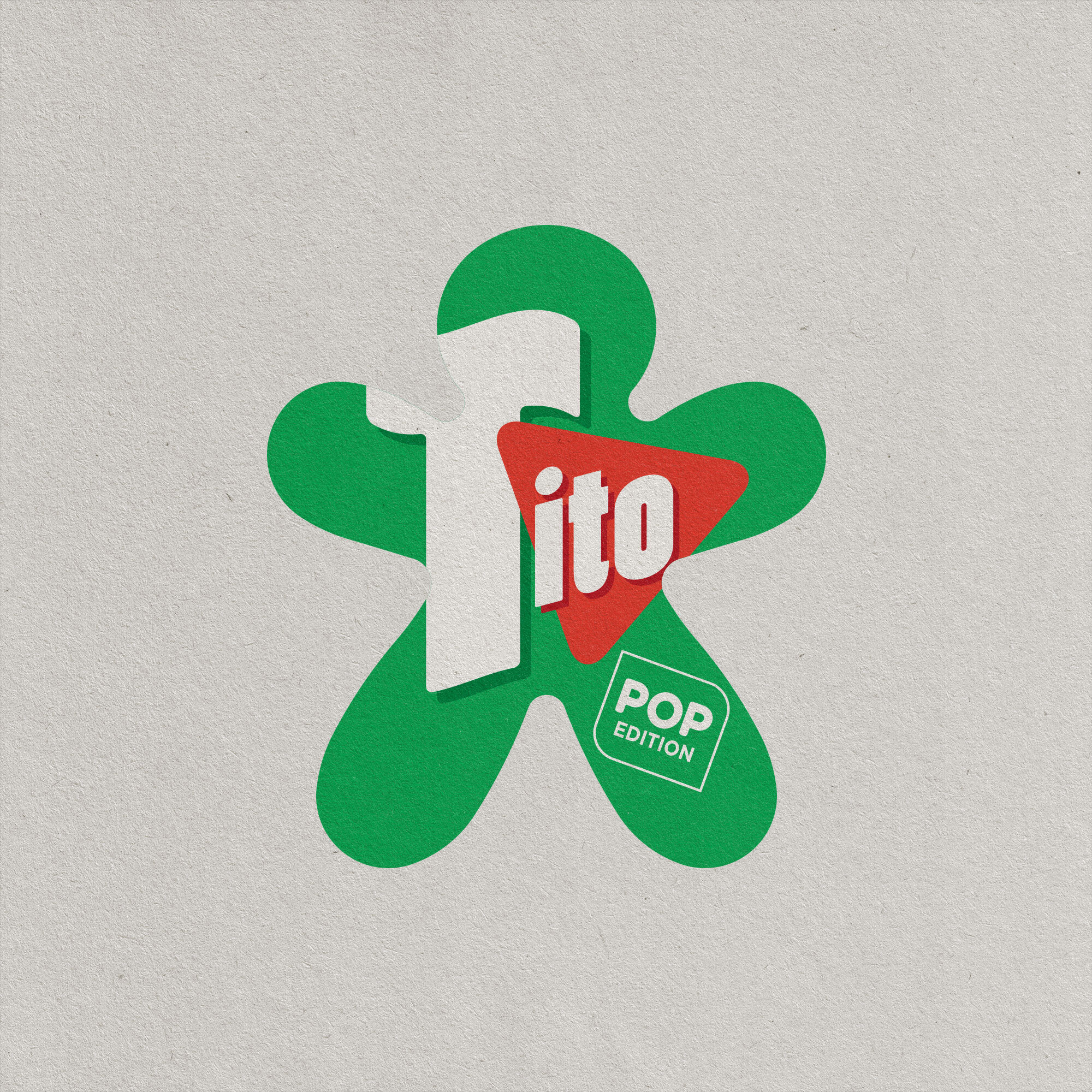
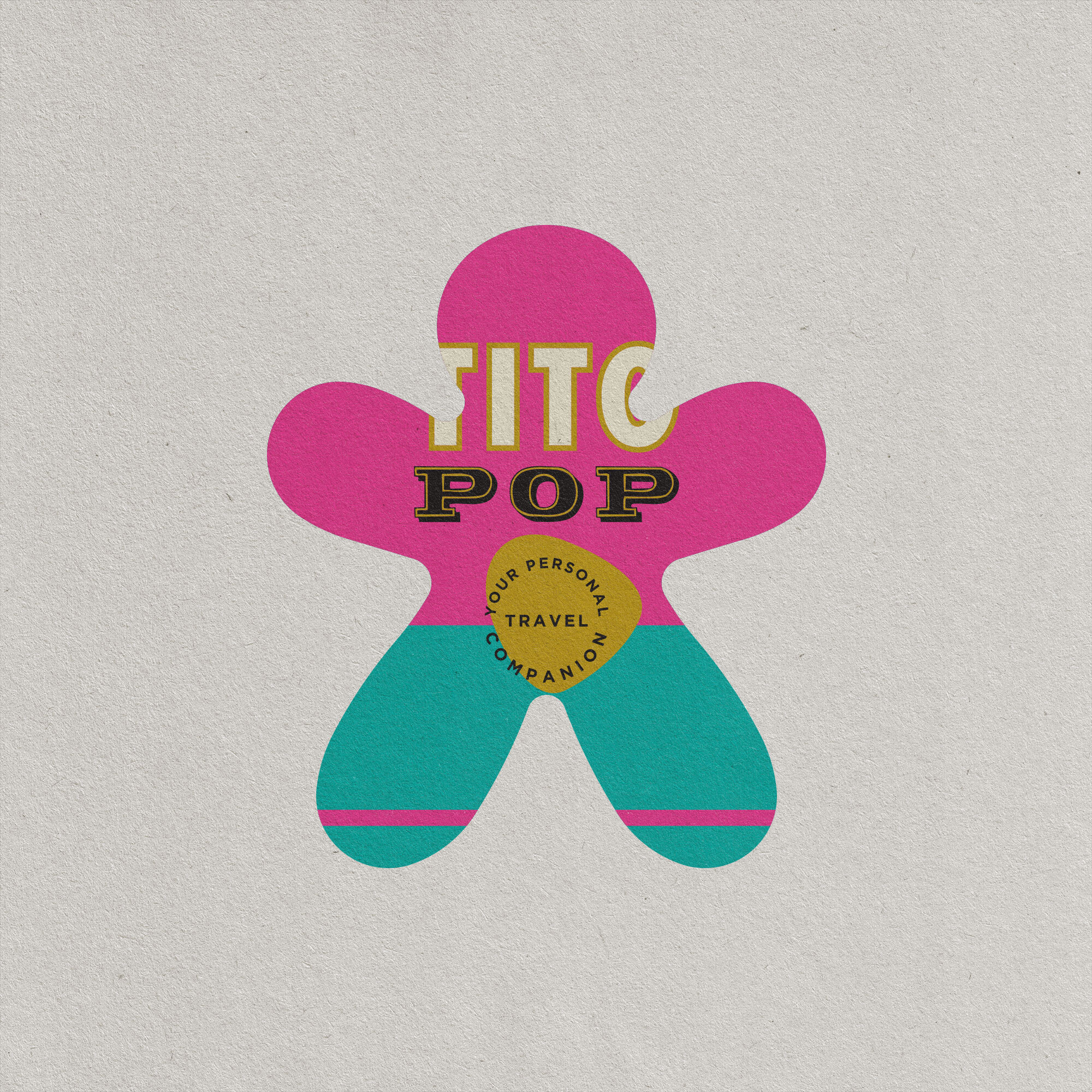
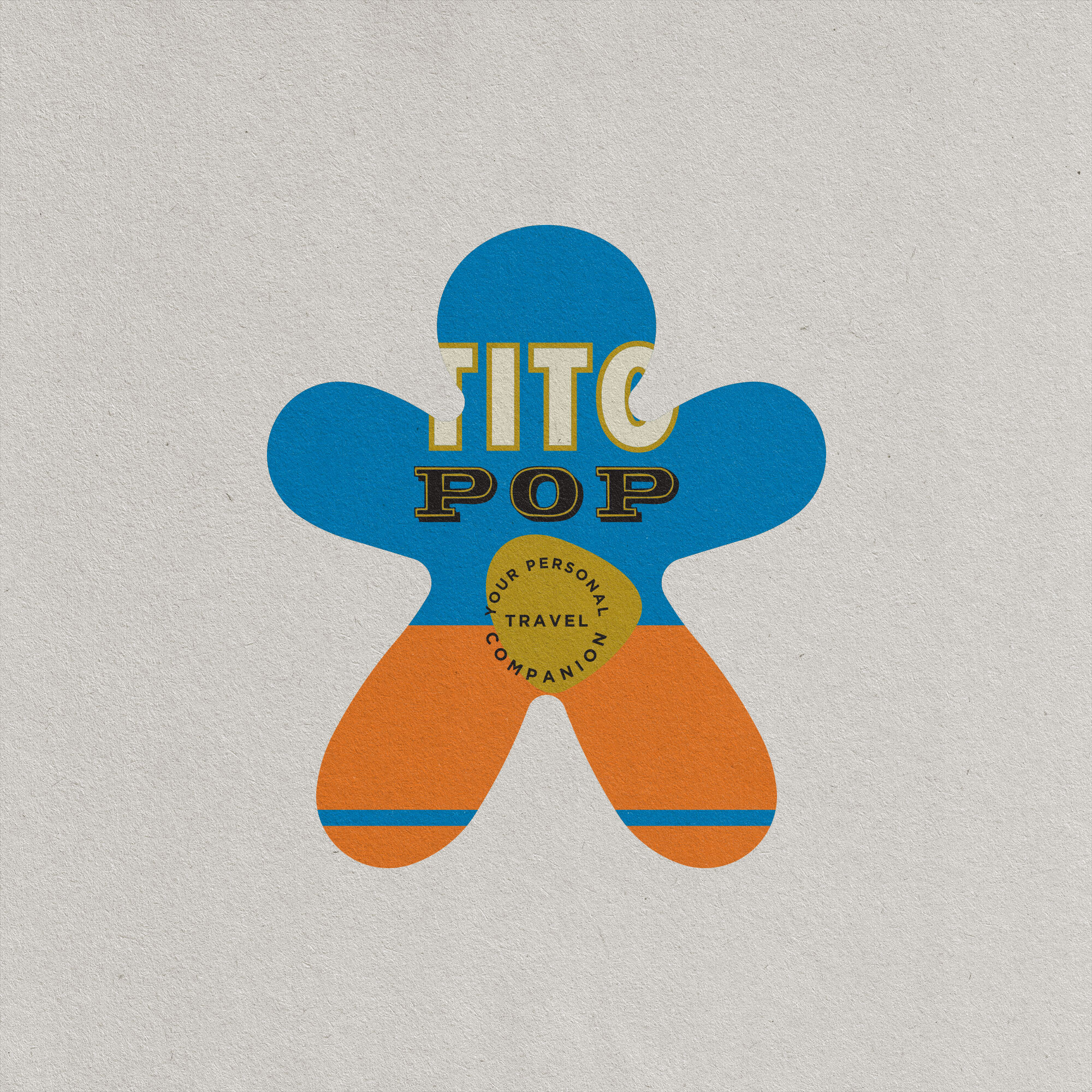
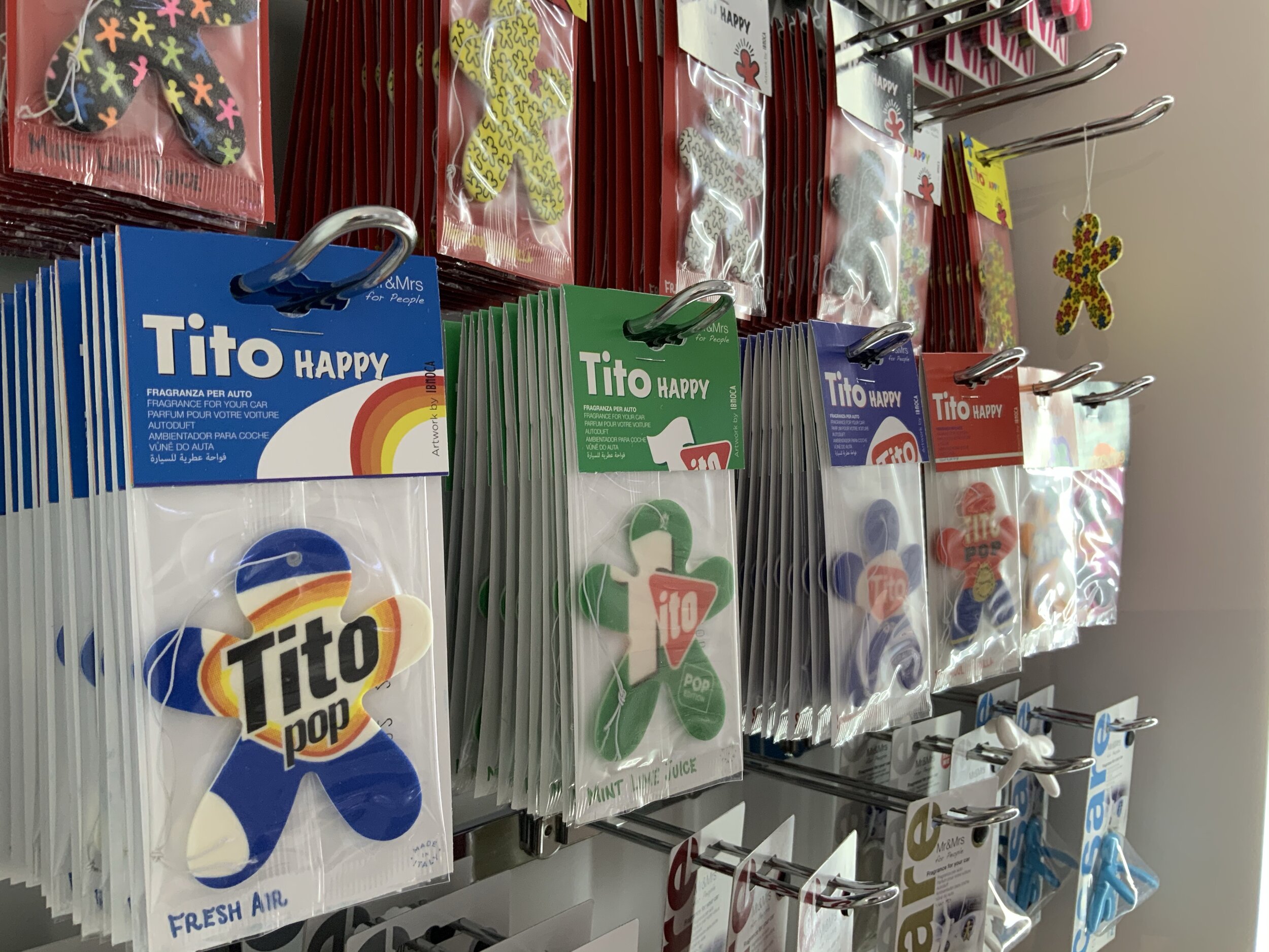
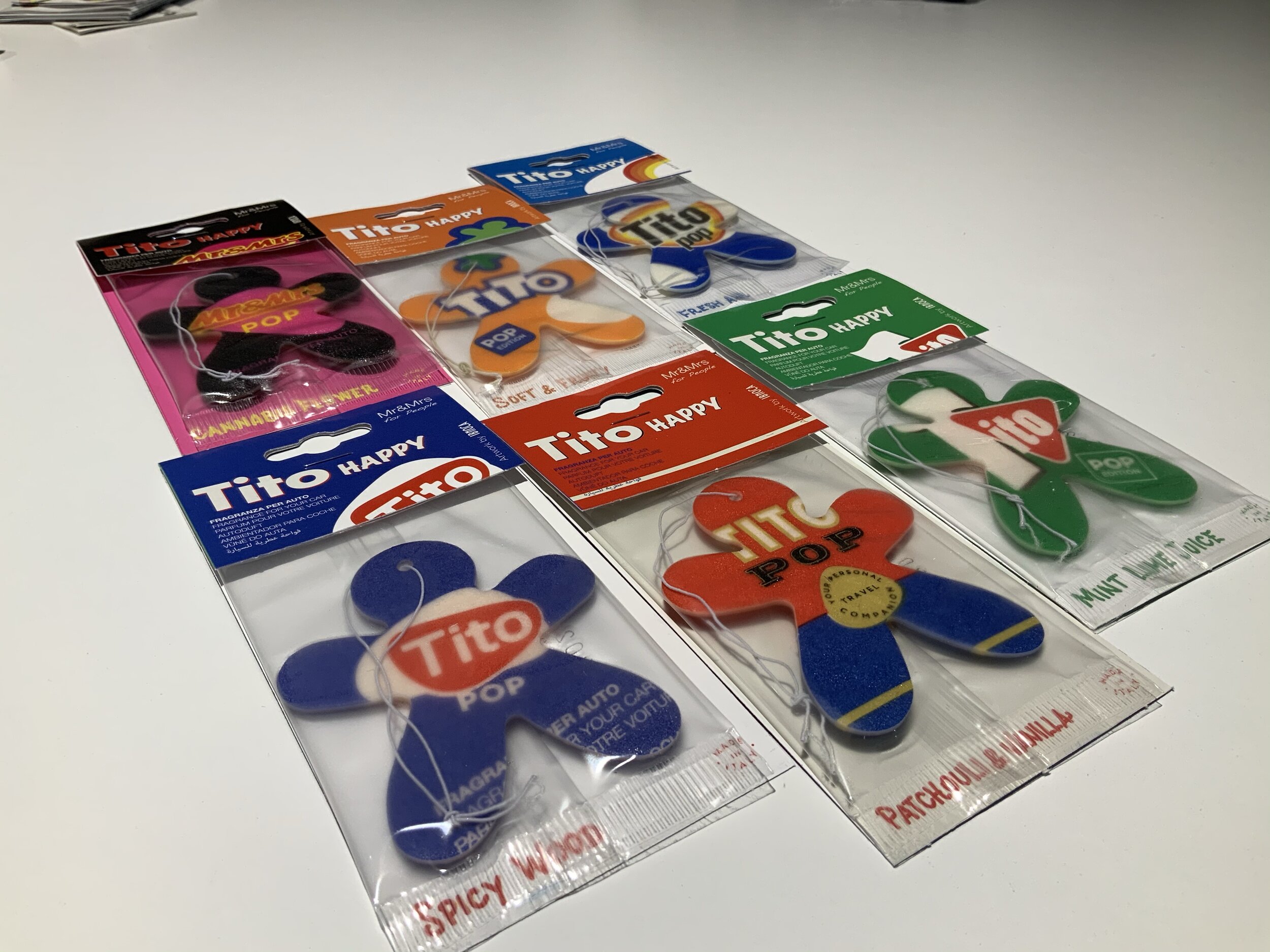
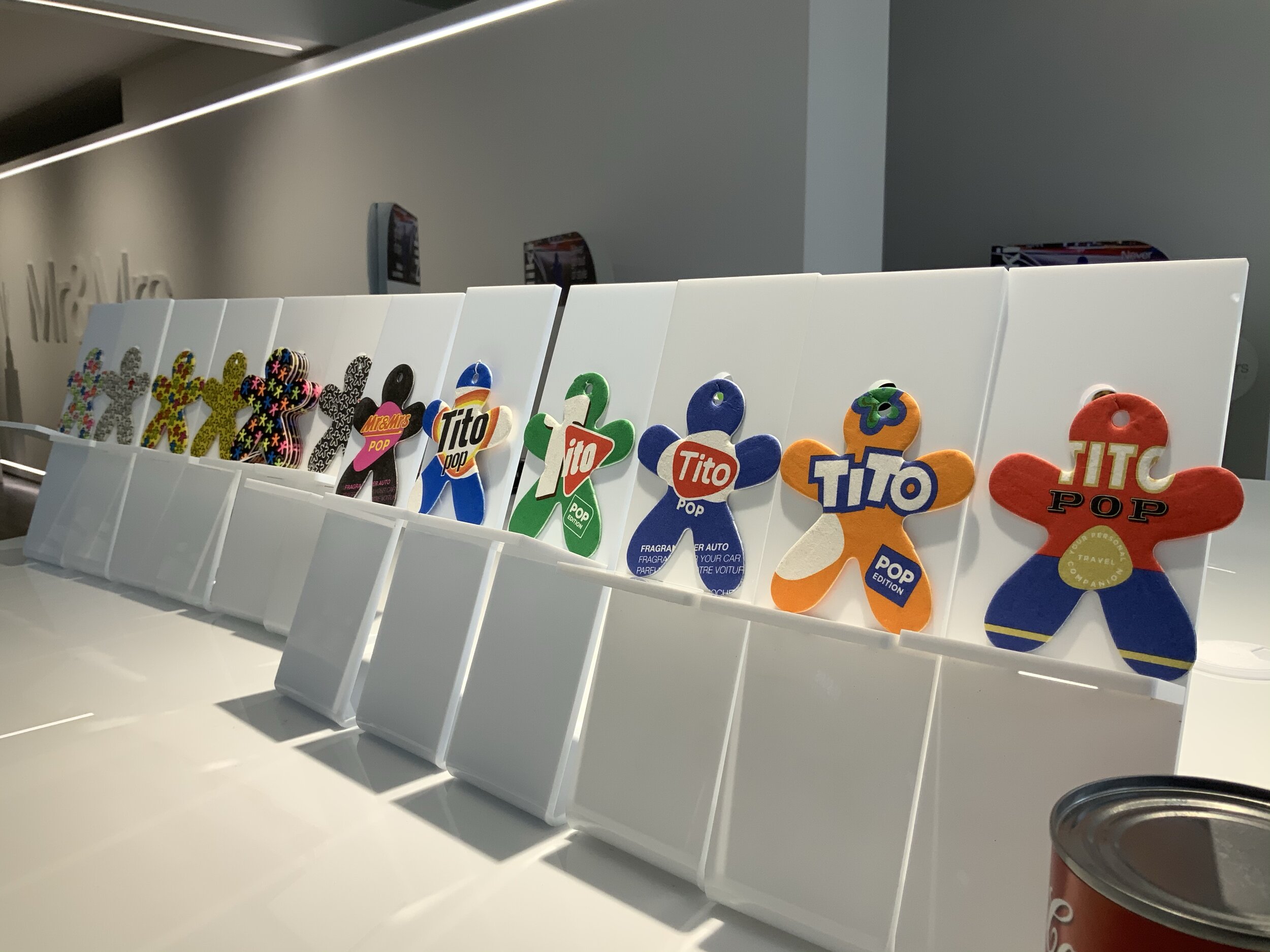
TITO by IBMOCA >
01
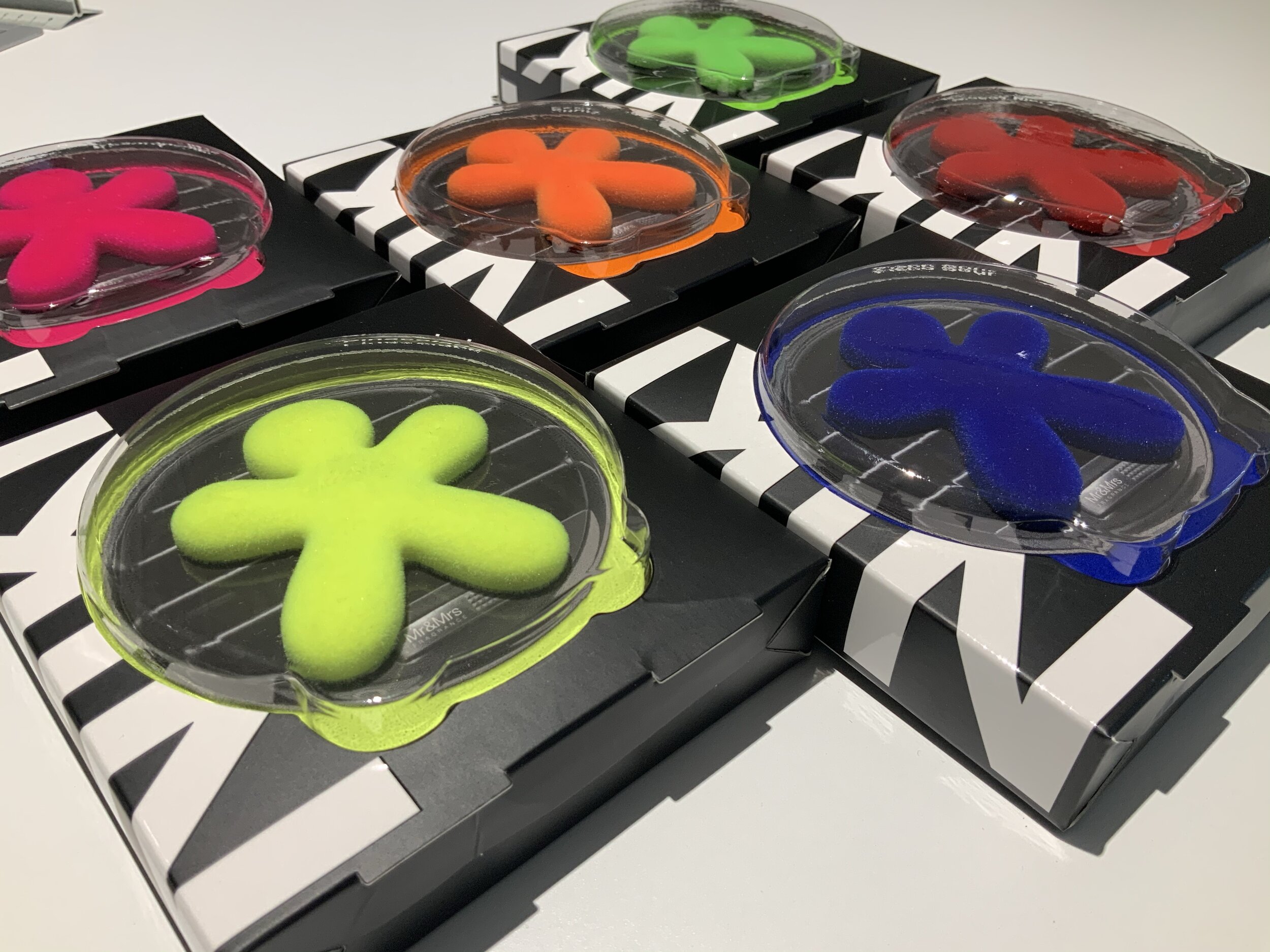
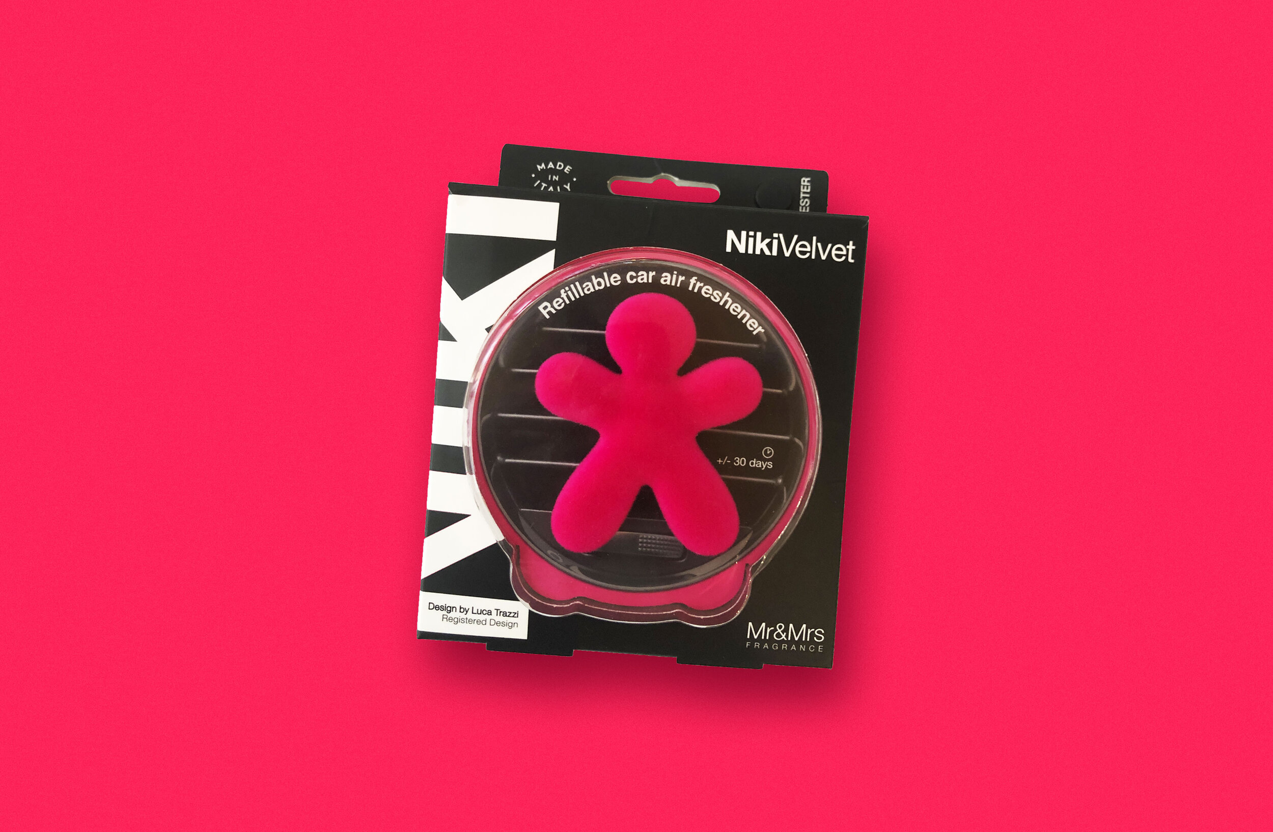
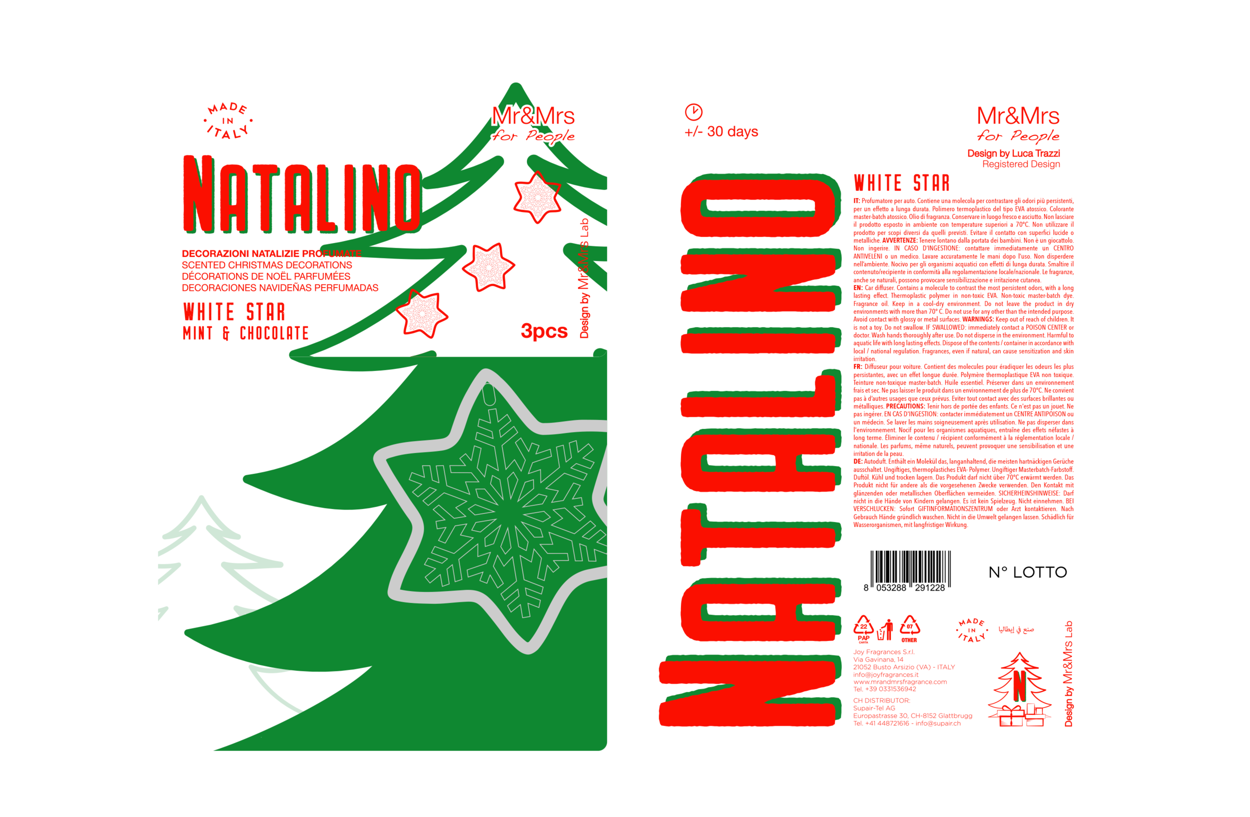
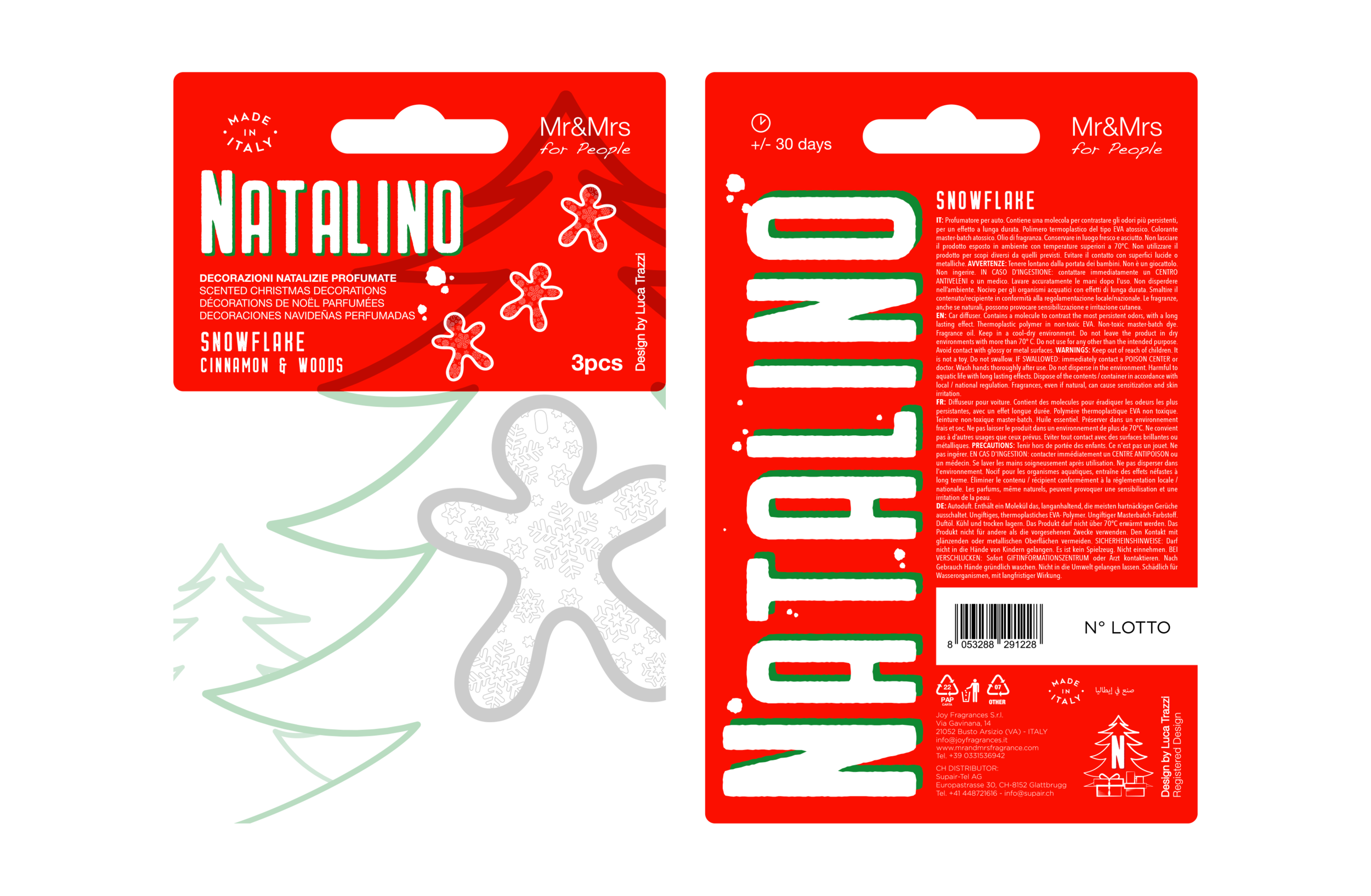
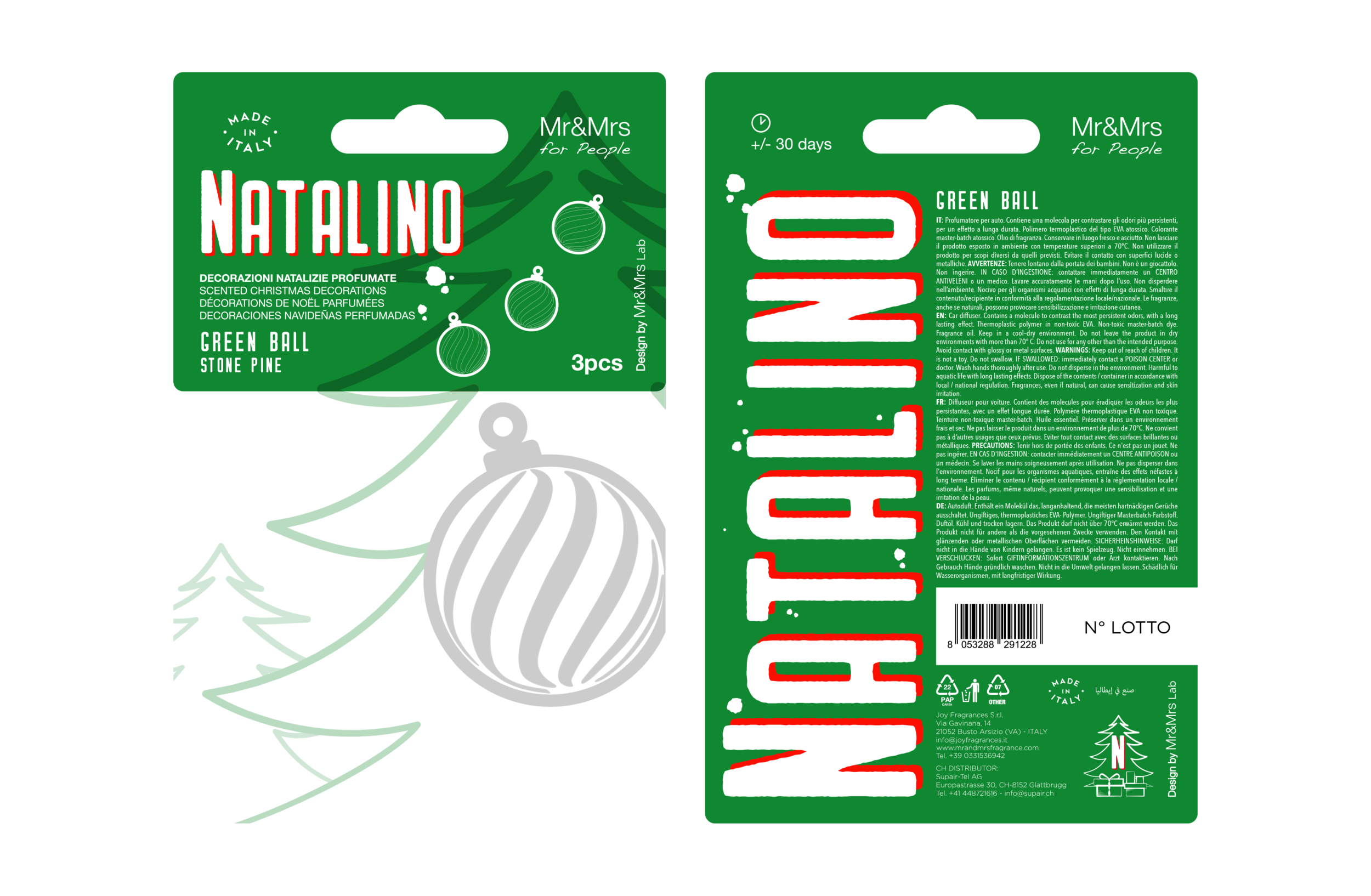
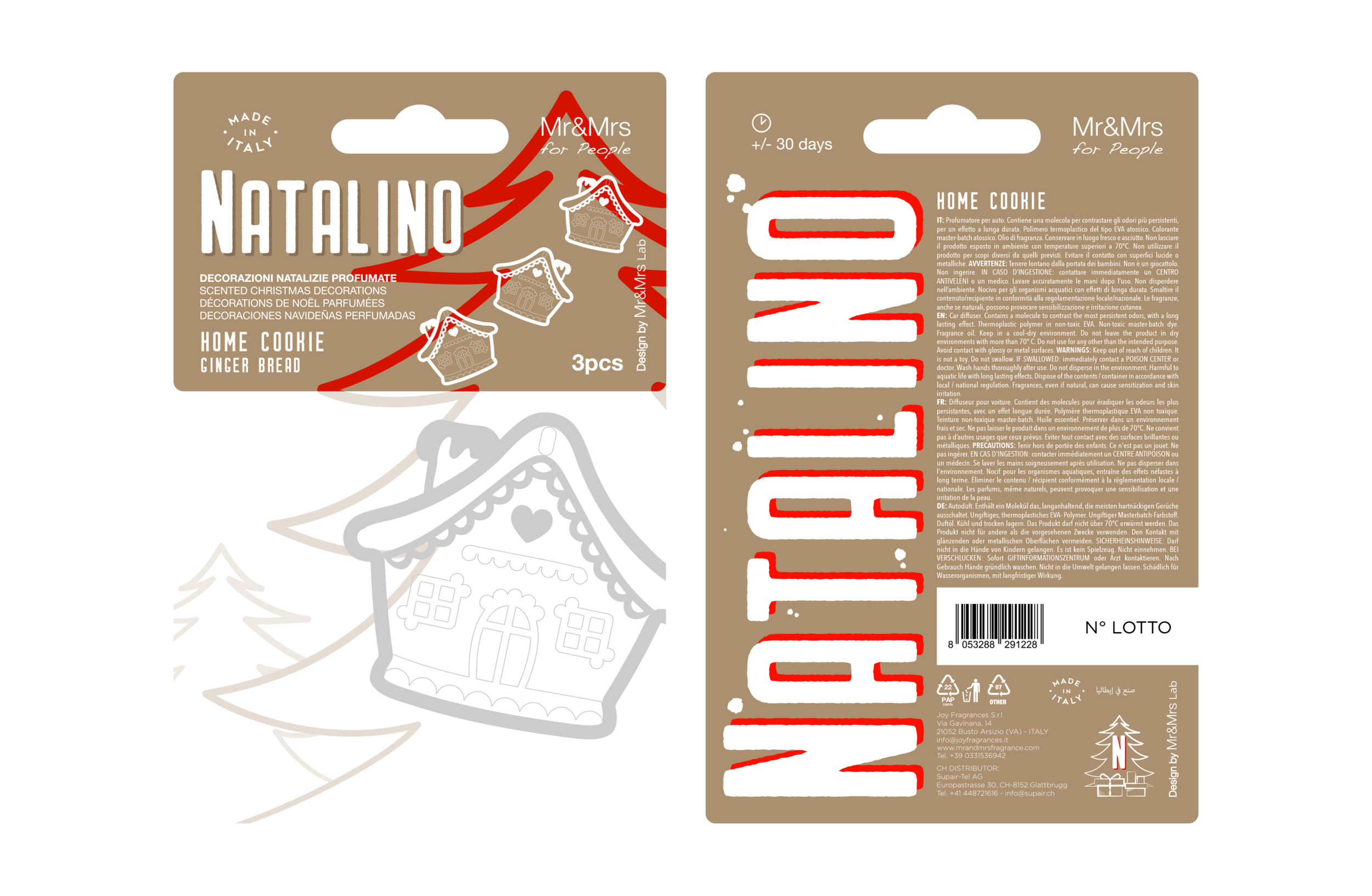
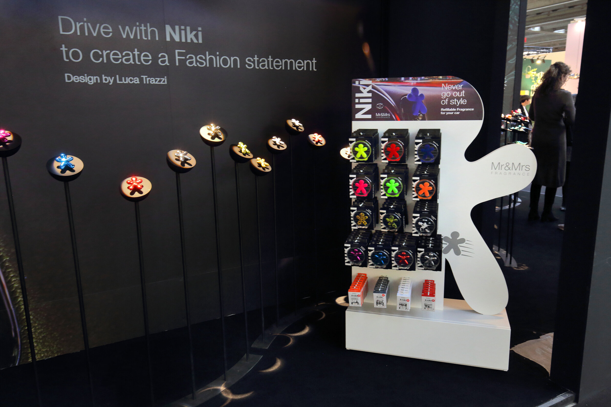
NATALINO ‘20
Presented in Christmas World - Frankfurt. Jan 2020
YOUR CHRISTMAS TREE IS NOW SCENTED! The magic of Christmas reveals a new surprising sensation. NATALINO adds a design touch to your Christmas tree decorations, with one more innovation: FRAGRANCE! Cinnamon, Ginger bread, Stone pine and Vanilla: four warm and lovely fragrances to create your scented Christmas.

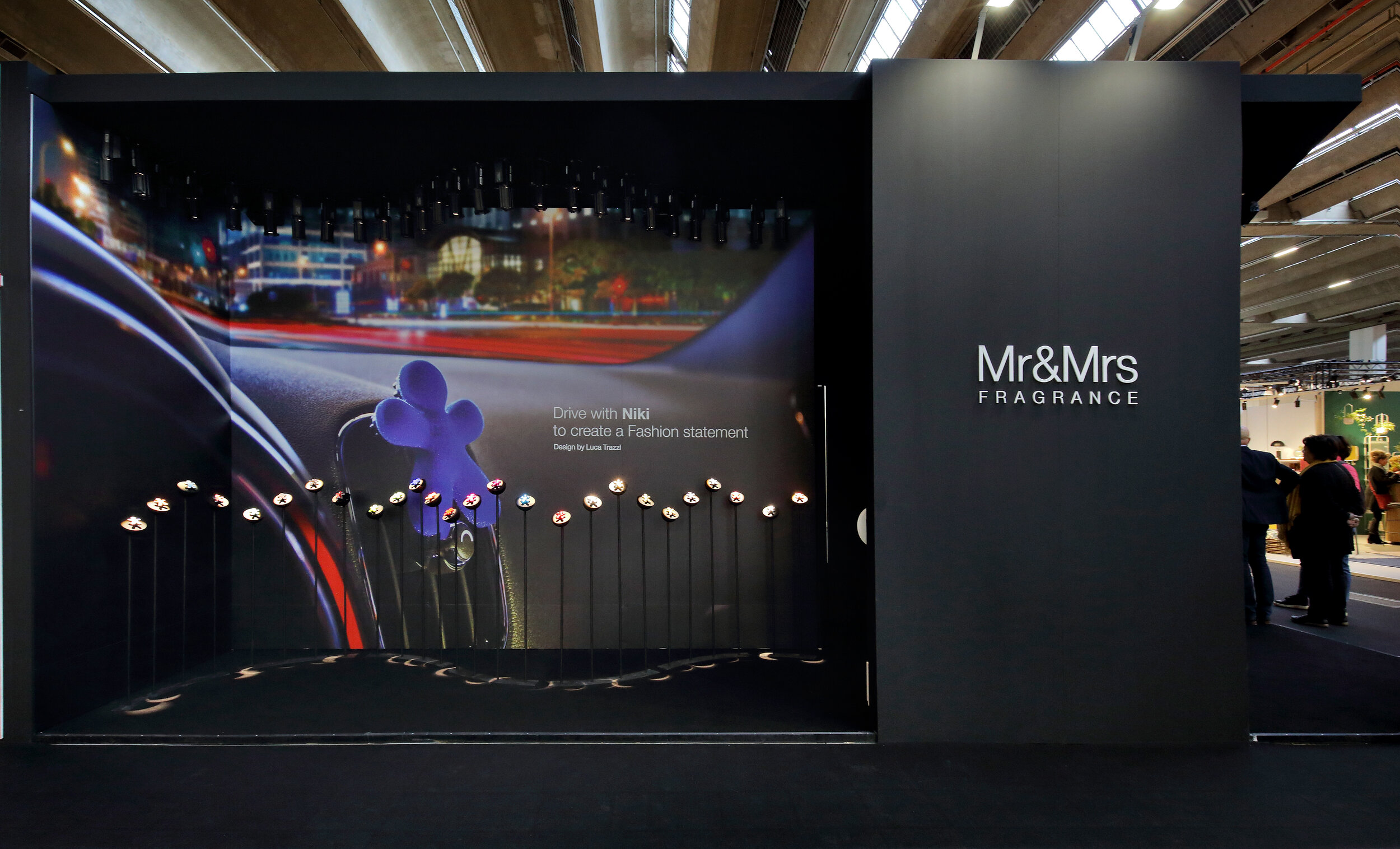
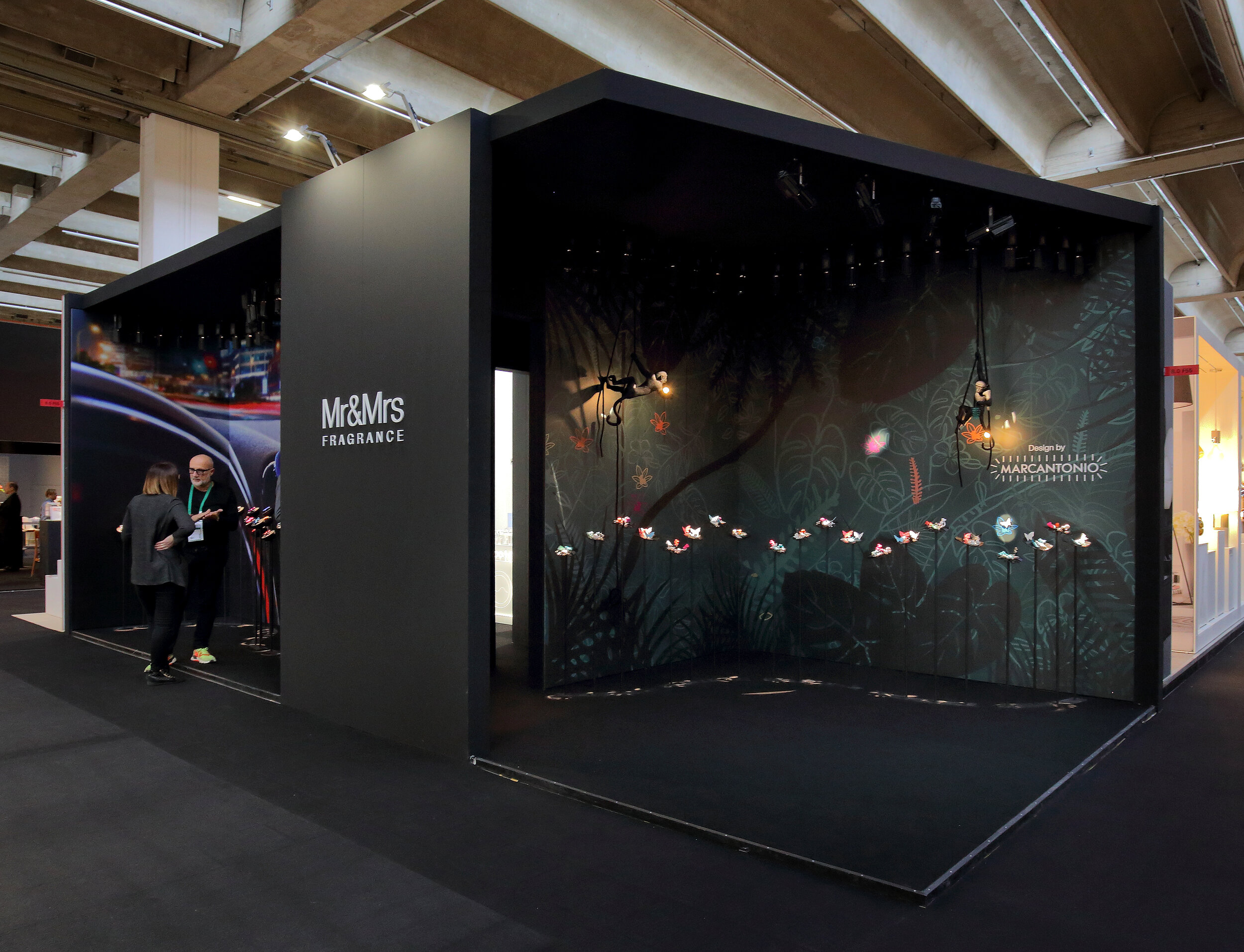
Retail Display Design
AMBIENTE 2020
Frankfurt Exhibition Stand
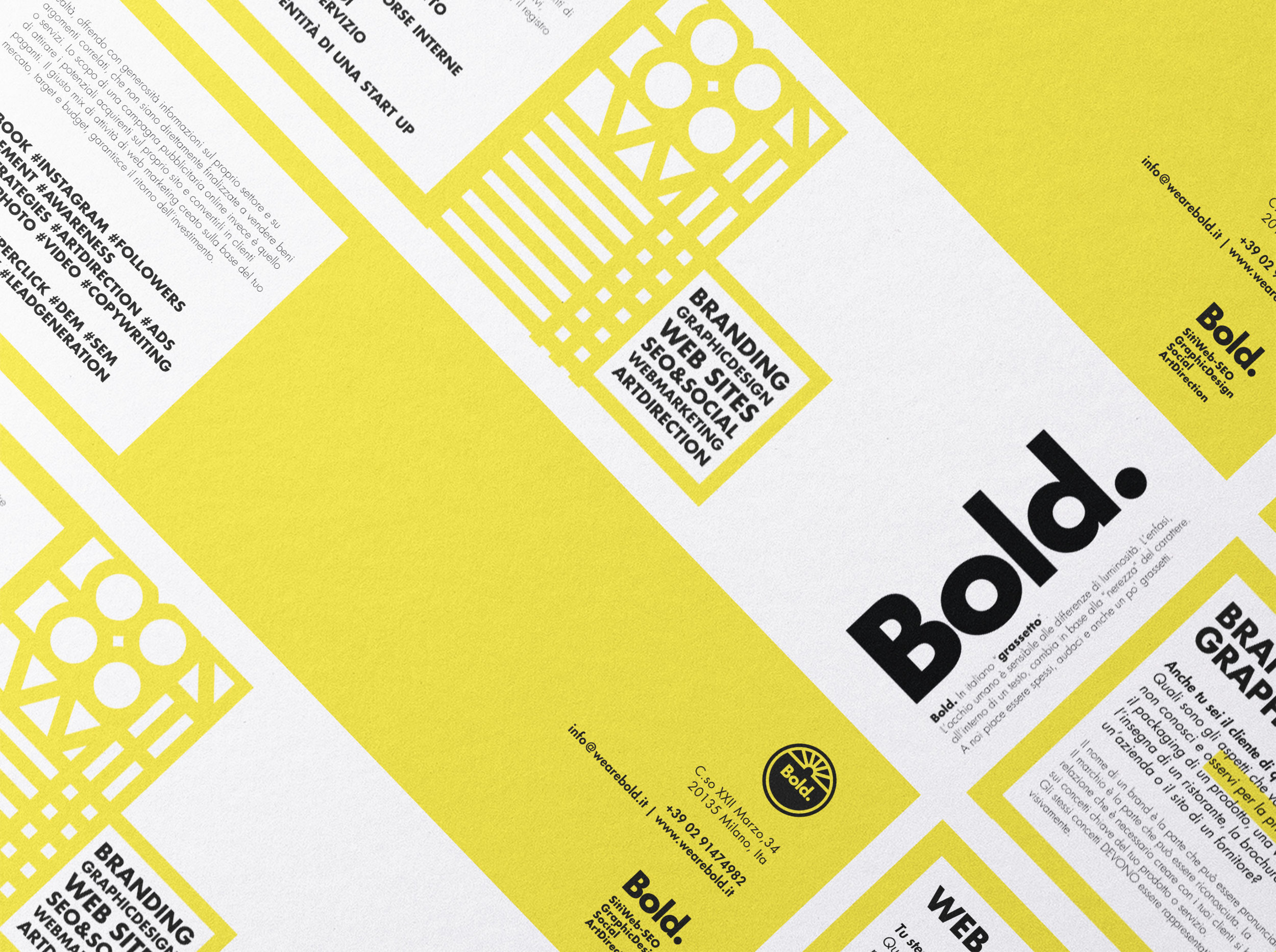
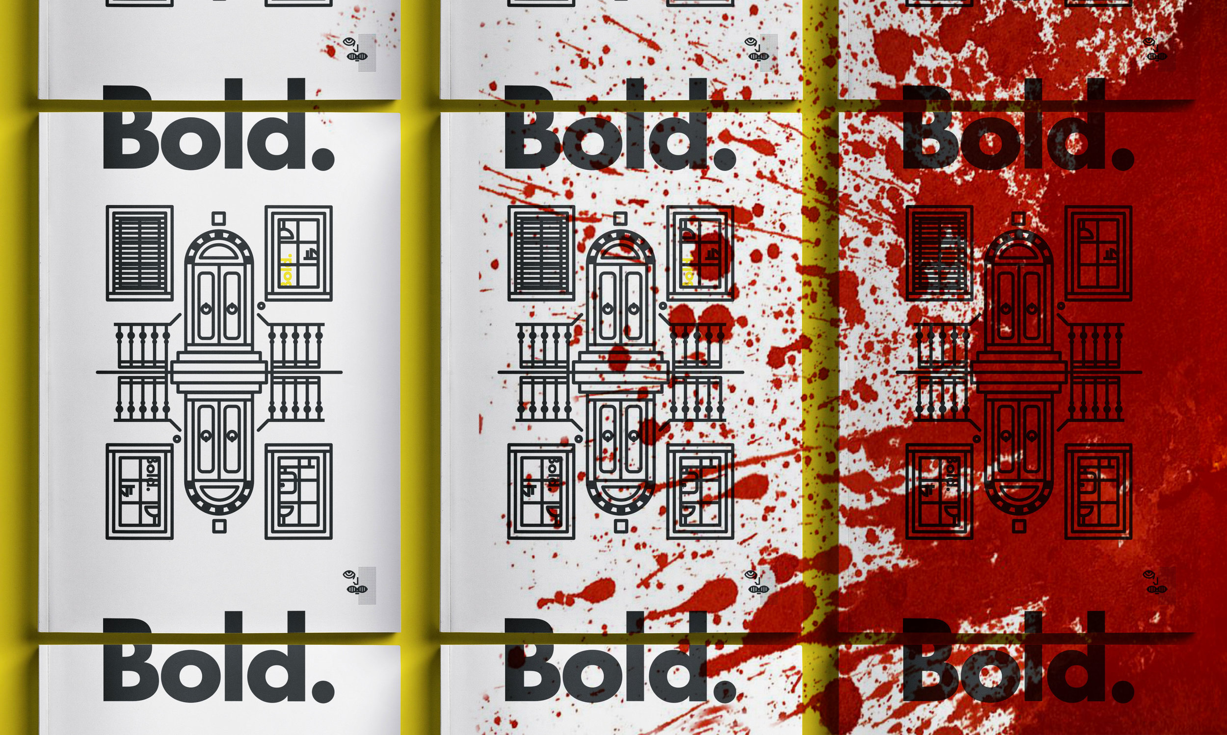
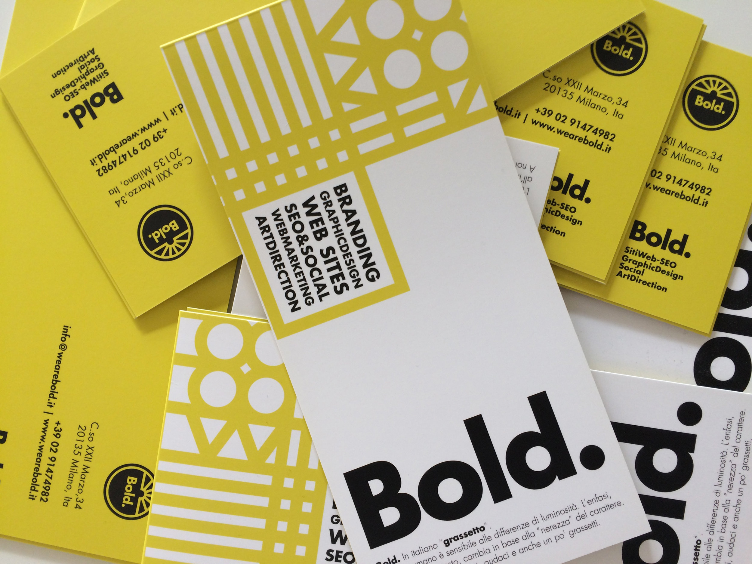
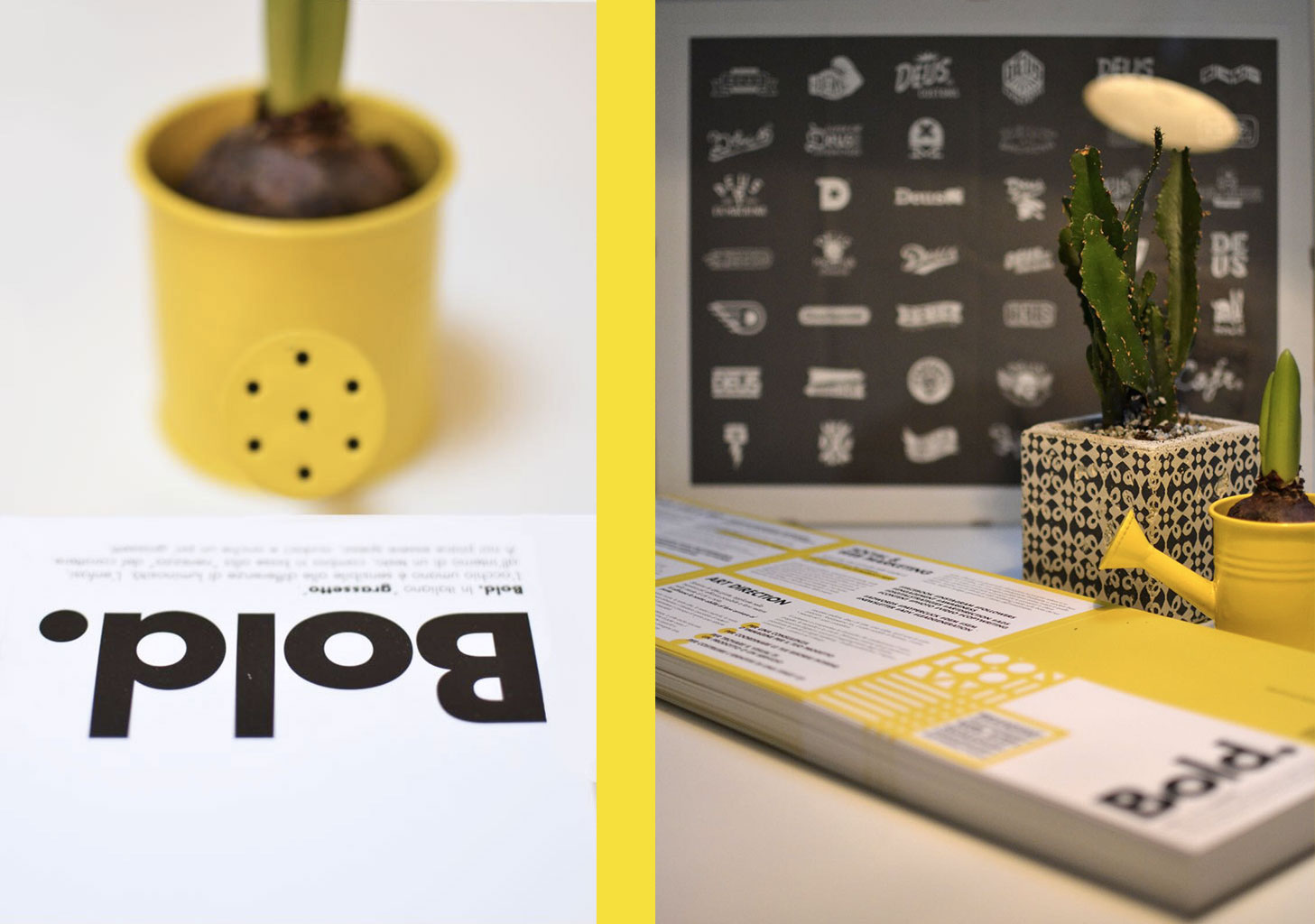
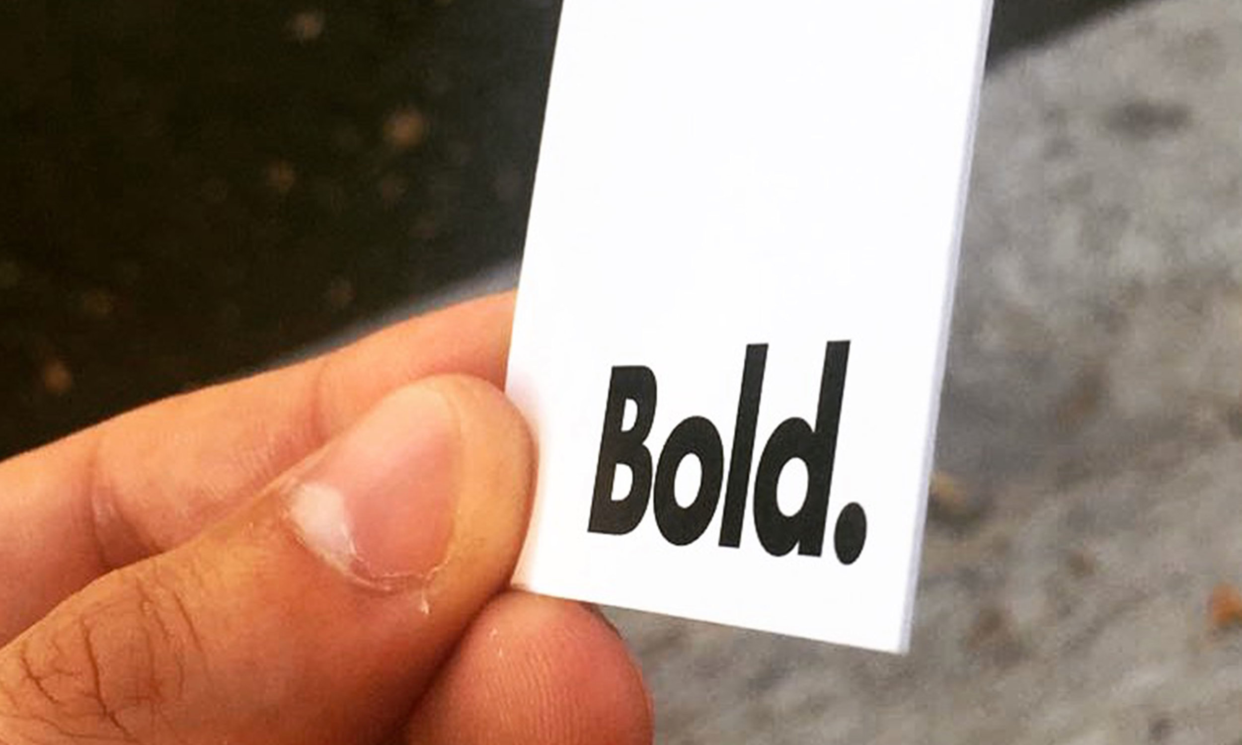
we are Bold.
Branding
02
JUST REGULAR? BE BOLD.


Bold. is a new Italian creative agency based in Milan, skilled in digital solutions. In quality of member of this team I've worked on the concept and creation of its Corporate image and Branding. Bold. in italiano “grassetto”. L’occhio umano è assai sensibile alle differenze di luminosità all’interno di un corpo di testo. Si può quindi distinguere tra tipi di enfasi, a seconda che l’enfasi cambi la “nerezza” del testo. In tipografia, il grassetto o neretto è un carattere più marcato e scuro del consueto che serve a dare maggior enfasi al testo, rispetto al carattere “normale”.
WHERE: MILAN, ITA YEAR: 2017 designed for: bold.
"STARTING FROM THE CREATION OF YOUR LOGO, WHICH WILL DISTINGUISH YOU FROM OTHERS AND WILL BECOME ALMOST YOUR SECOND IDENTITY CARD, TO THE STUDY OF YOUR CORPORATE / COMMERCIAL IMAGE, WE PUT INTO PLAY OUR SKILLS AND TRENDS THAT INFLUENCE YOUR MARKET."
VISIT SITE
“Siate audaci, coraggiosi, decisi e anche un po’ sfrontati, mai normali. ”

Team @Bold.


Francesco Bigatti

ART DIRECTOR & GRAPHIC DESIGNER

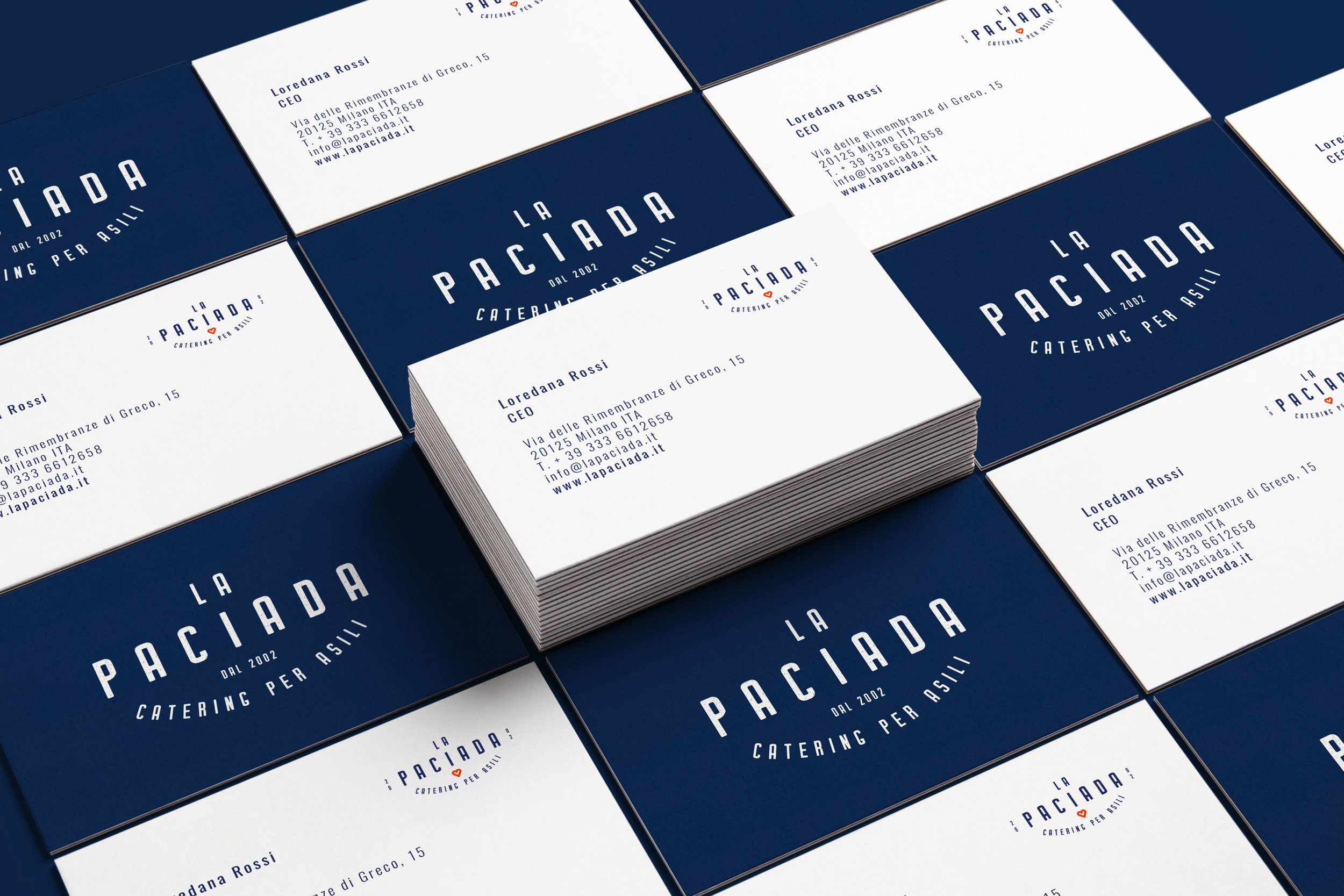
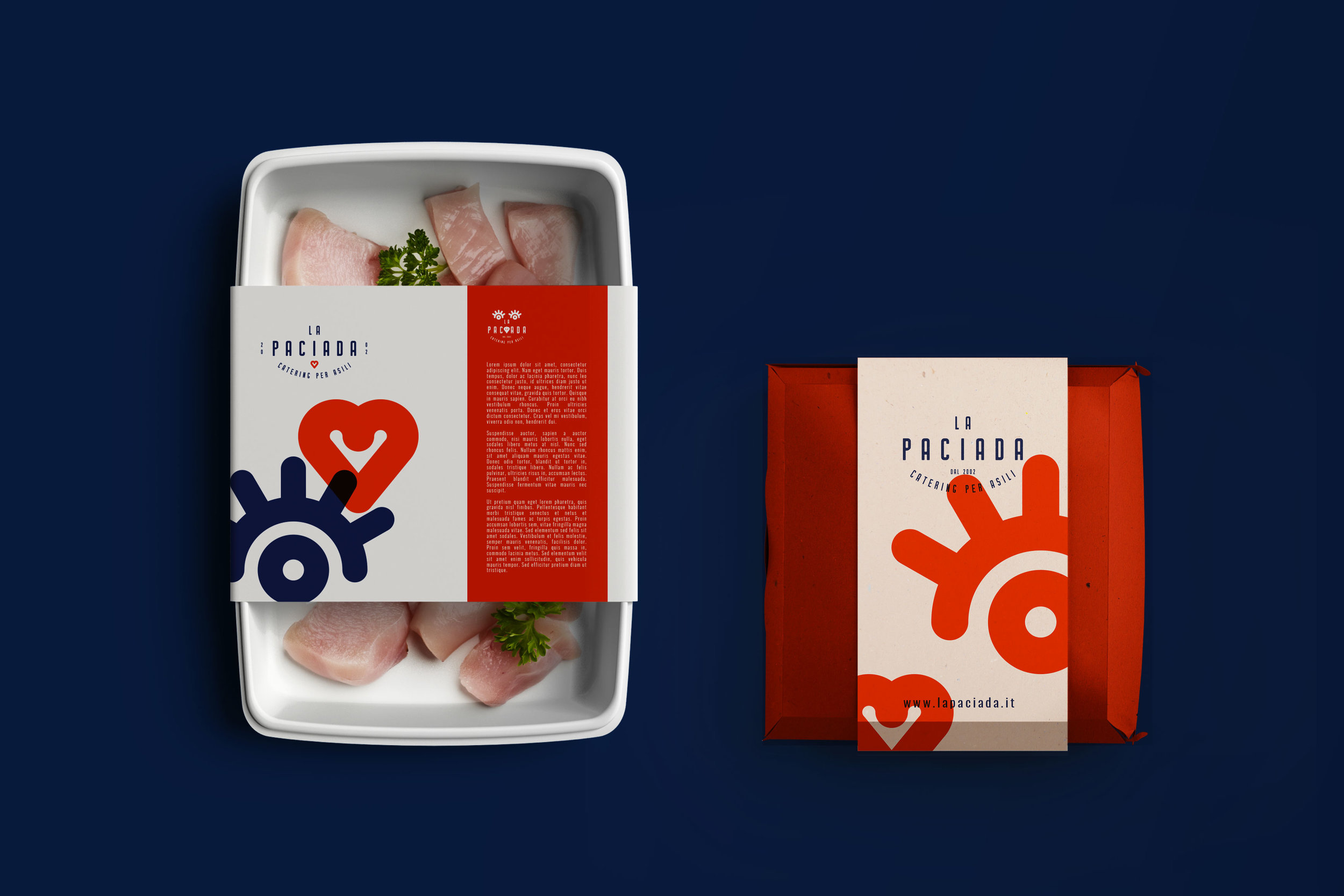
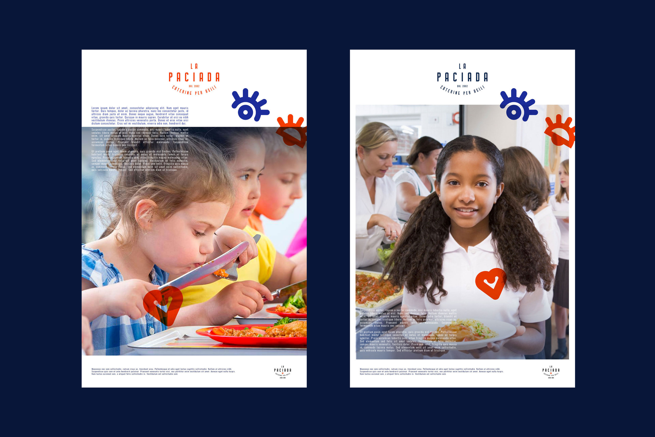
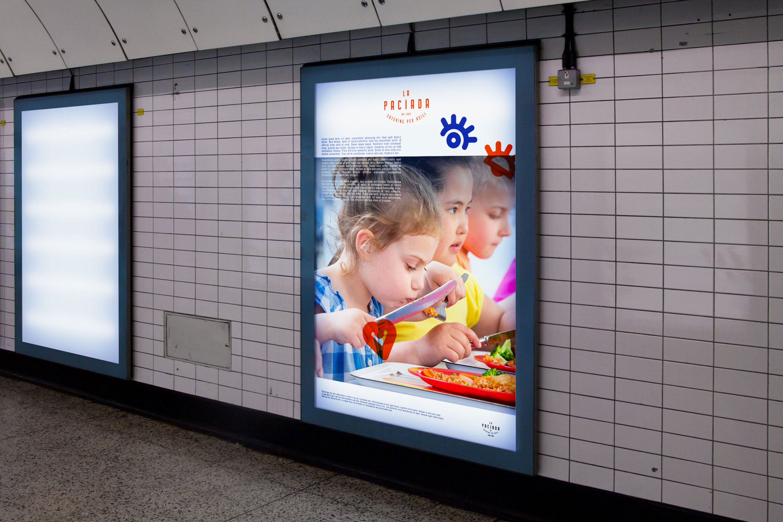
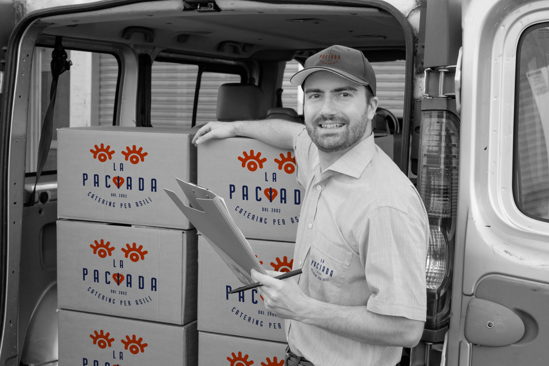
la Paciada
Logo Design | Packaging
03
CATERING PER ASILI
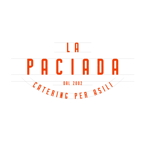

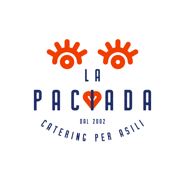
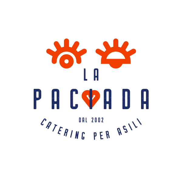
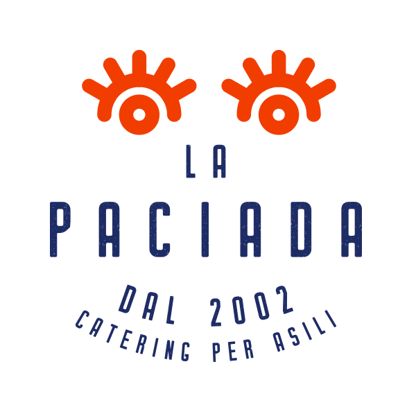
La comunicazione visiva ideale de LA PACIADA ha come primo obiettivo quello di agire parallelamente su due target precisi e distinti: convincere e attrarre potenziali clienti B2B (asili) e sensibilizzare e creare empatia con le famiglie e i bambini.
Per questo per la creazione dell’identità visiva abbiamo deciso di intraprendere una strada che possa soddisfare entrambi i target di riferimento e per questo il risultato finale è un LOGO DINAMICO che aiuti anche chi oggi non si serve del vostro servizio a mantenere vivo il ricordo grazie a un’immagine accattivante e forte.
WHERE: MILAN, ITA YEAR: 2019 designed for: bold.
LA PACIADA's ideal visual communication has as its first objective that of acting in parallel on two precise and distinct targets: convincing and attracting potential B2B customers (kindergartens) and raising awareness and creating empathy with families and children.
VISIT SITE
Ibmoca Goods
Branding | Custom Typography
04
Nowadays Vintage Goods for Gents and their Ladies

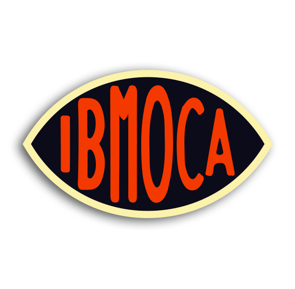
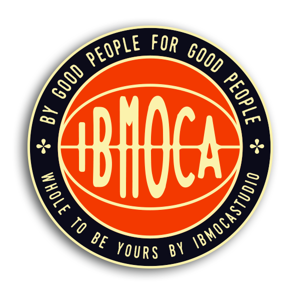
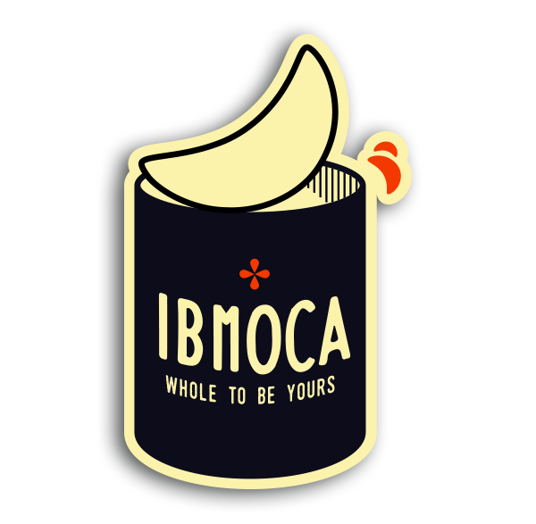
L’intenzione con Ibmoca Goods è quella di catturare e dare vita a prodotti semplici ma accattivanti attraverso rigorose tecniche che hanno contribuito a modellare le fondamenta dell'umanità per oltre un secolo. Ibmoca si ispira infatti all’arte Vittoriana che influenza il suo modo di vedere sia gli spazi che gli oggetti e mischiando spunti e ispirazioni più moderne di impronta USA, disegna questi Badge.
WHERE: MILAN • ITA YEAR: 2018
Nowadays Vintage Goods for Gents and their Ladies @ibmoca_goods
My mission is to capture the many senses of wonders the exist and flourish in todays world, to add to ourselves a sense of value through days of old, using rigorous techniques that have helped shape the foundations of mankind for over a century.
“By Good People for Good People”

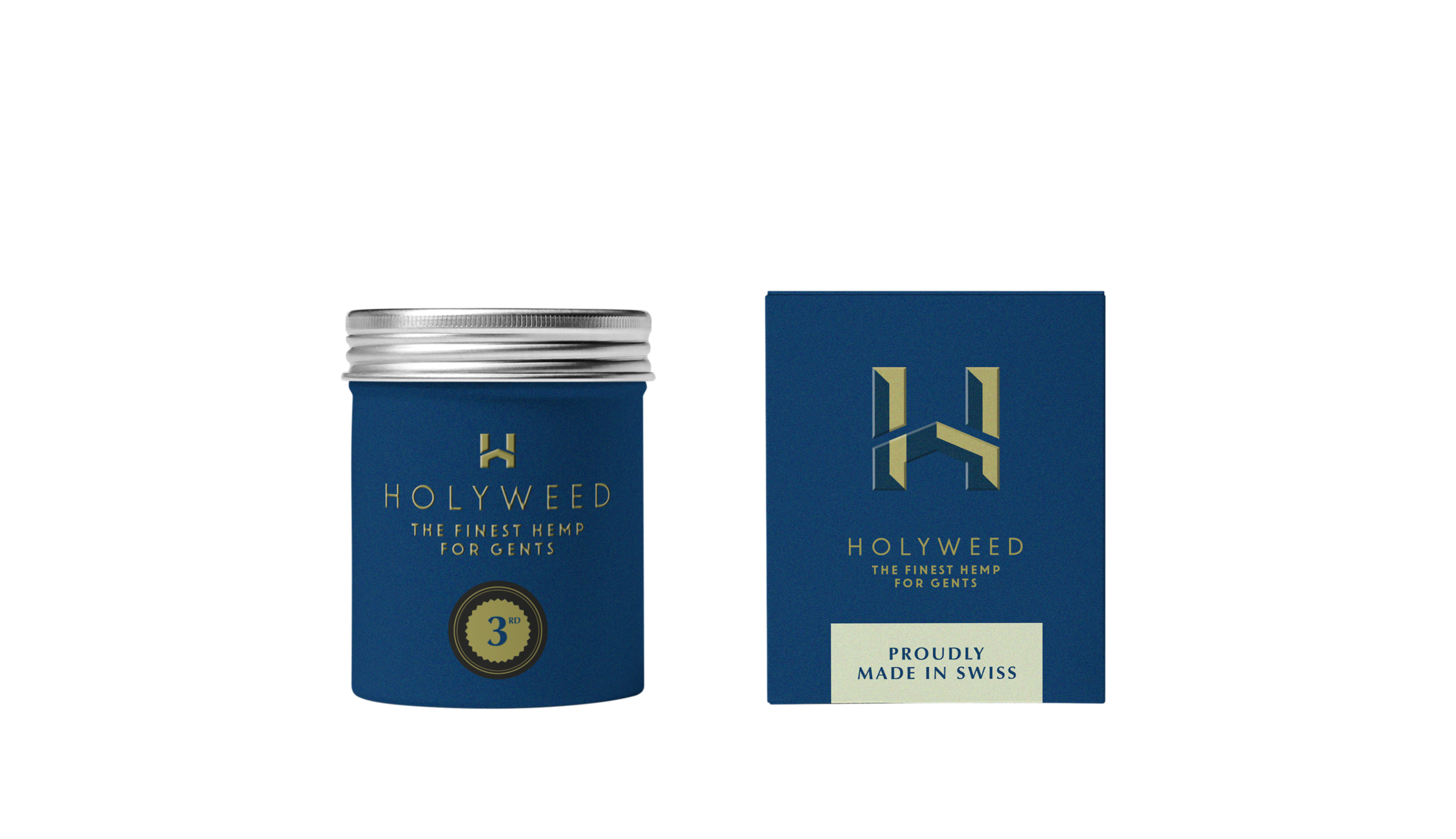
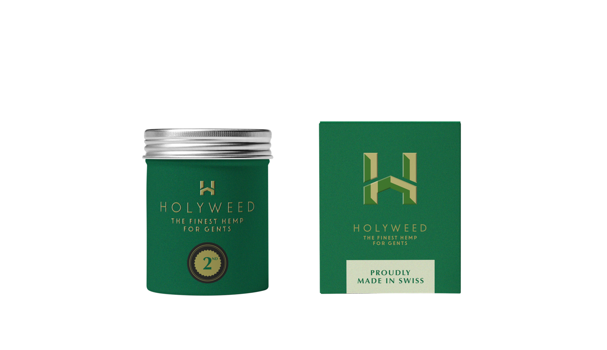
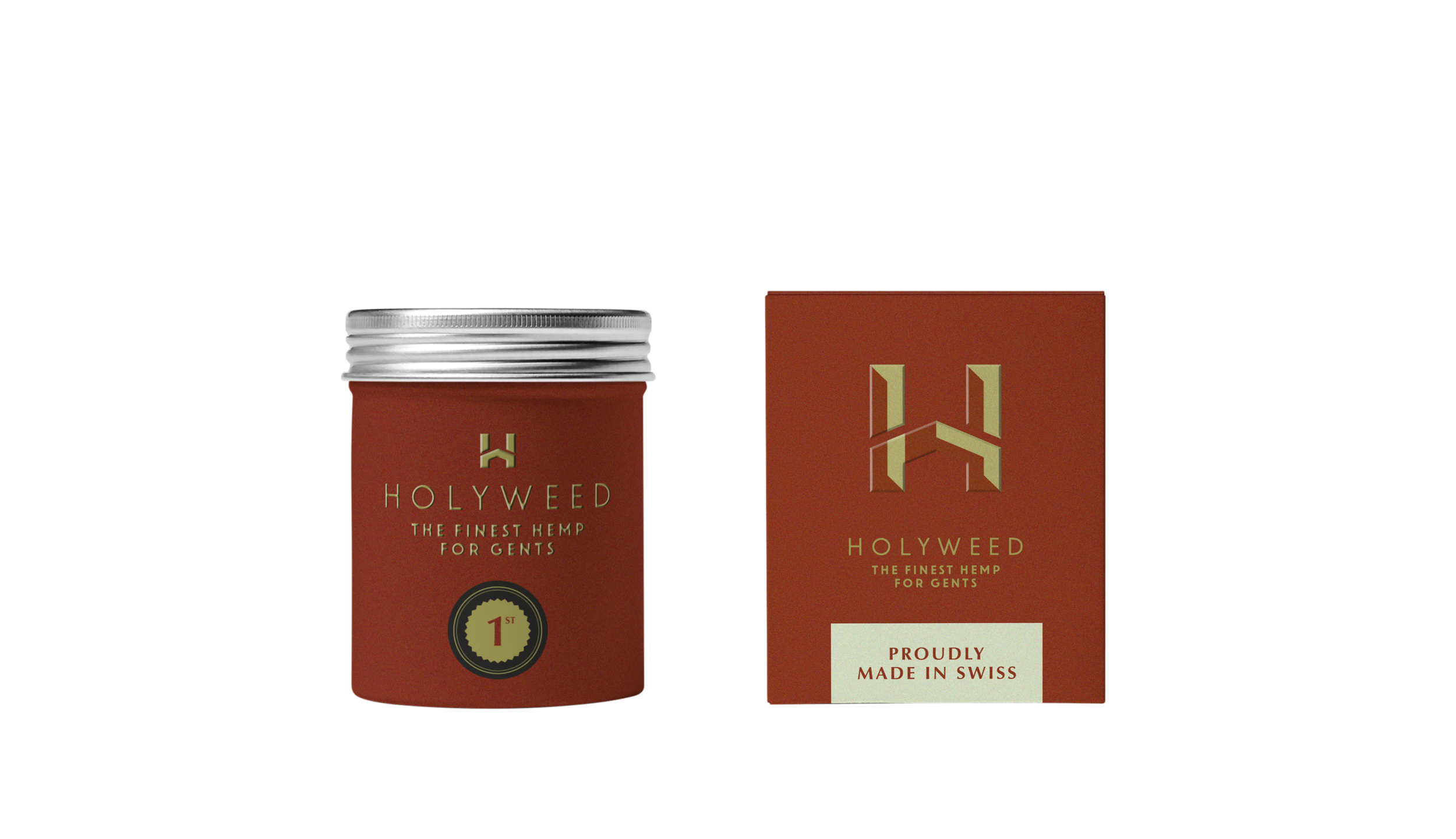
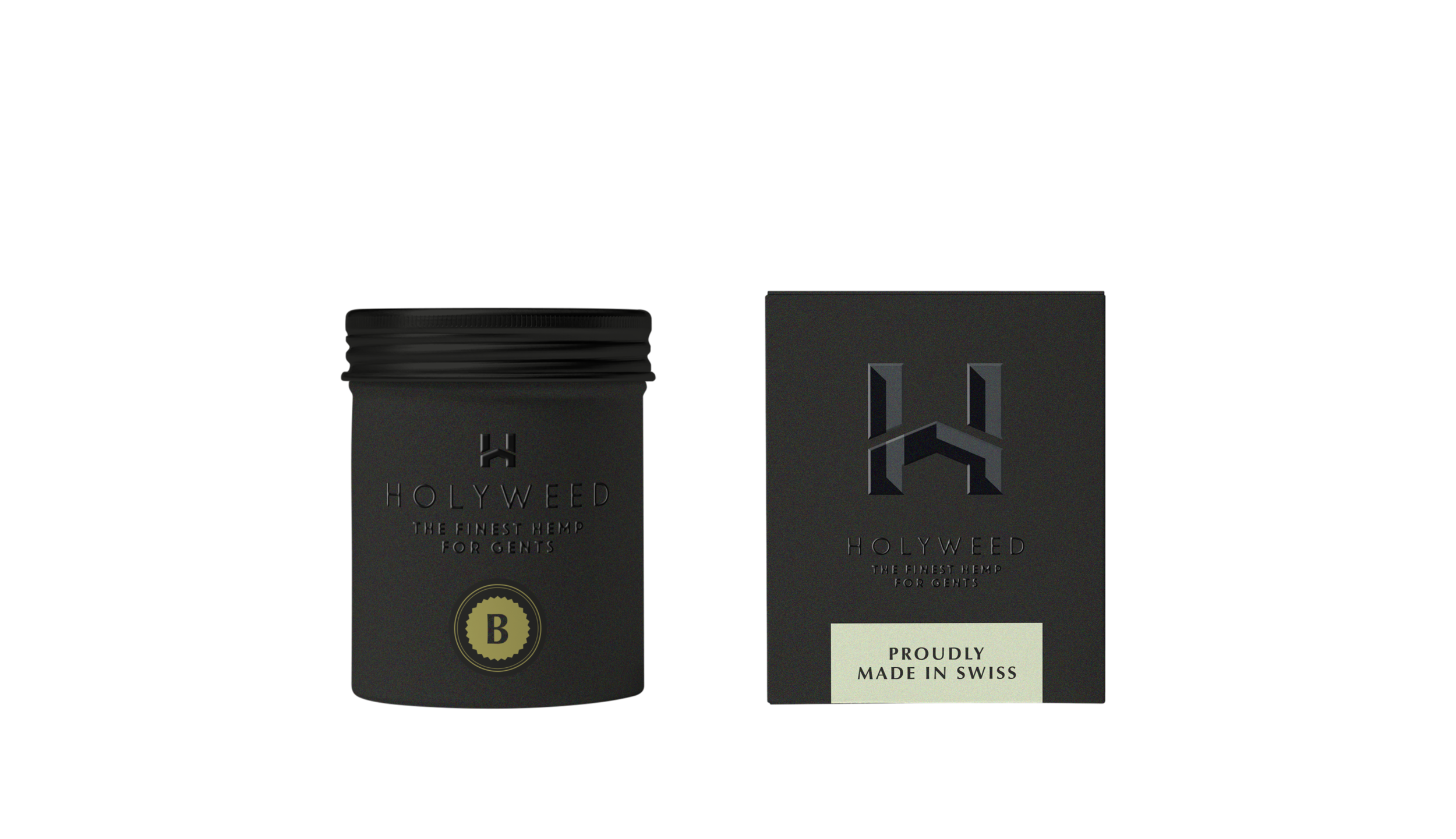
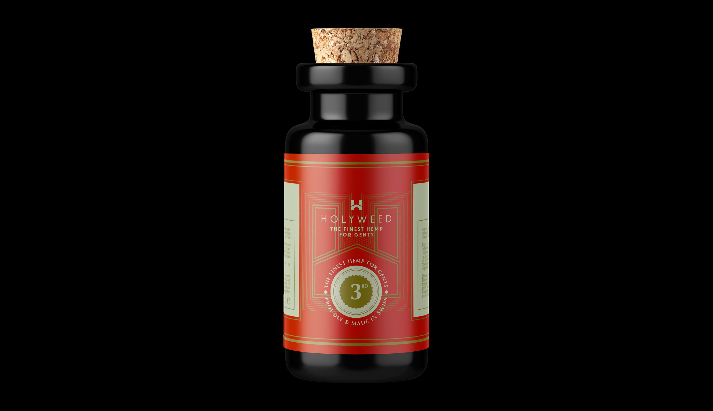
Holyweed
Logo Design | Naming | Packaging | Merch
05
THE FINEST HEMP FOR GENTS


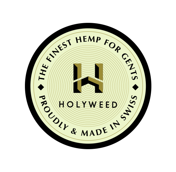
MOOD e TARGET: giovane ma non indirizzato direttamente all'adolescente, semmai, all'uomo (di mezza età e / o più giovane) a cui piace indulgere nel piacere di qualche vizio. "Biker" attento alle tendenze e in grado di scegliere ciò che è meglio per lui senza essere troppo condizionato. È più lui a creare la tendenza che seguirla.
WHERE: MILAN, ITA YEAR: 2018 designed for: bold.
PROUDLY MADE IN SWISS
MOOD AND TARGET: Youth but not addressed directly to the teenager, if anything, to the man (middle-aged and / or younger) who likes to indulge the pleasure of some vice. "Biker" careful to trends and able to choose what is best for him without being too conditioned. It is more than that the tendency does it


la Pinkedda
Logo Design
06
A GREAT VIEW ON TAVOLARA
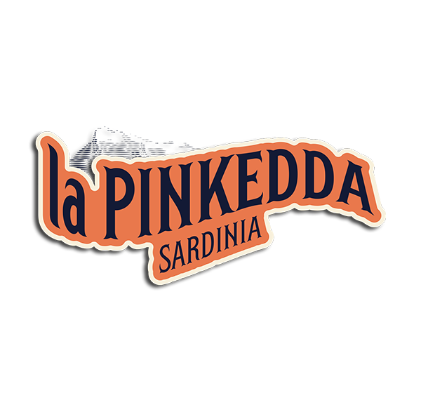

Per ottenere un bilanciamento visivo, è stato necessario creare un sistema. Non solo per tipo e colore, ma anche per trame sottili, mezzitoni e effetti di stampa offset per dare al sito un tocco autentico. Tutti i pezzi grafici di grandi dimensioni seguono lo stesso sistema per riportare una coerenza in tutto il progetto.
KEYWORDS: SARDEGNA, TRAVEL, HOLIDAY, SEA, EXPLORE
WHERE: SARDINIA, ITA YEAR: 2018 designed for: bold.
To achieve a visual balance, it was necessary to create a system. Not only for type and color, but also for thin textures, halftones and offset printing effects to give the site an authentic touch. All large graphic pieces follow the same system to report consistency throughout the project.


Django Academy
Branding, Art Direction
07
THE THEORY OF LIGHT
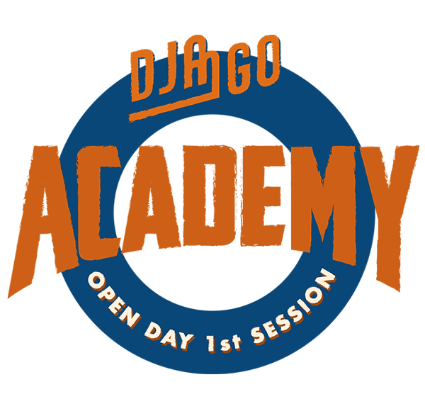

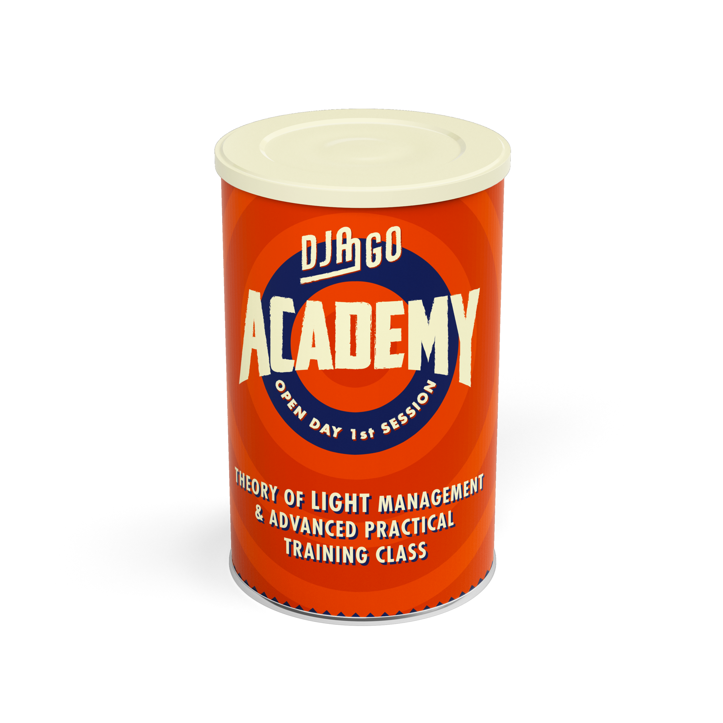
Un nuovo progetto pensato e promosso da Django Management incentrato sulla Teoria della Luce. Un corso avanzato di formazione pratica che tocca tutti i punti sia teorici che pratici della corretta gestione della Luce durante i set fotografici. Un corso dedicato sia a chi si trova alle prime armi con la fotografia che a chi ha già dimestichezza con questa disciplina.
KEYWORDS: PHOTOGRAPHY, LIGHT, TECHNICS, SCHOOL
WHERE: MILAN, ITA YEAR: 2018 designed for: bold.
A new project designed and promoted by Django Management focused on the Theory of Light. An advanced practical training course that covers all the theoretical and practical points of correct Light management during photo shoots. A course dedicated both to those who are beginners with photography and to those already familiar with this discipline.


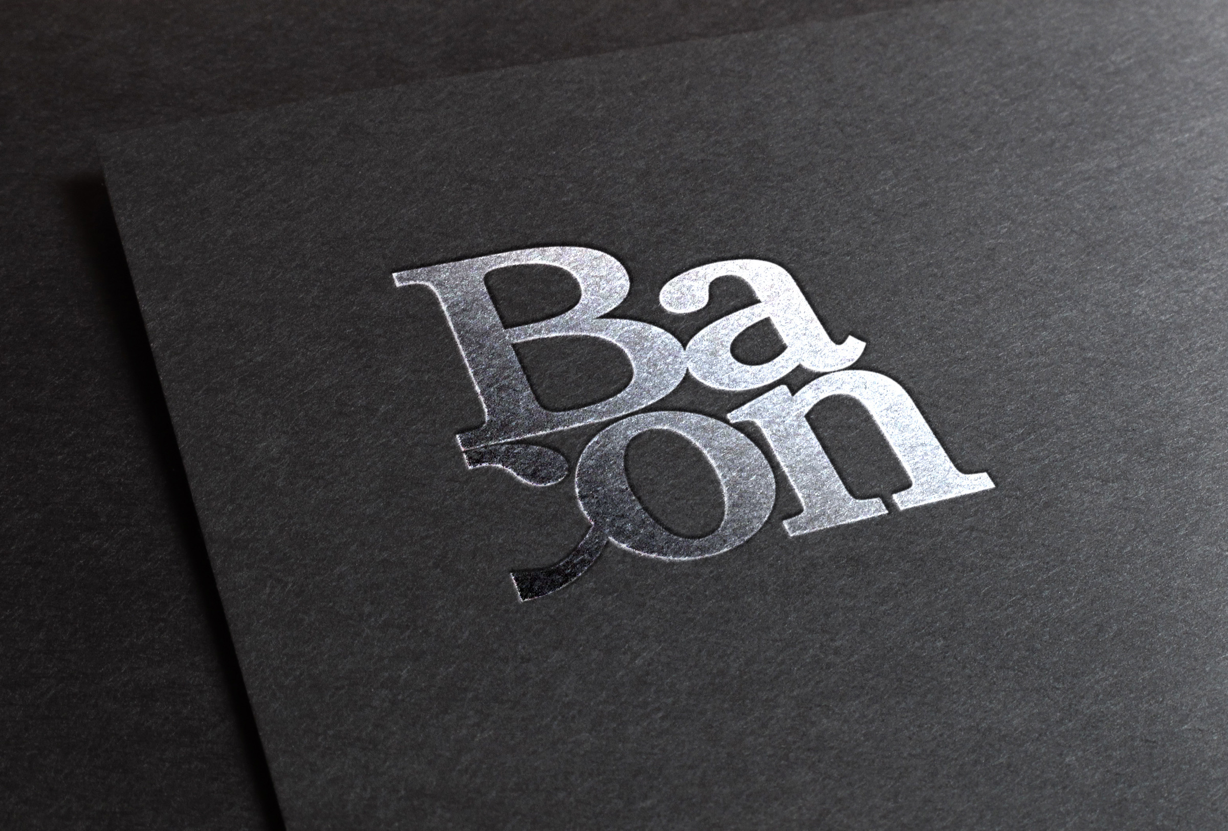
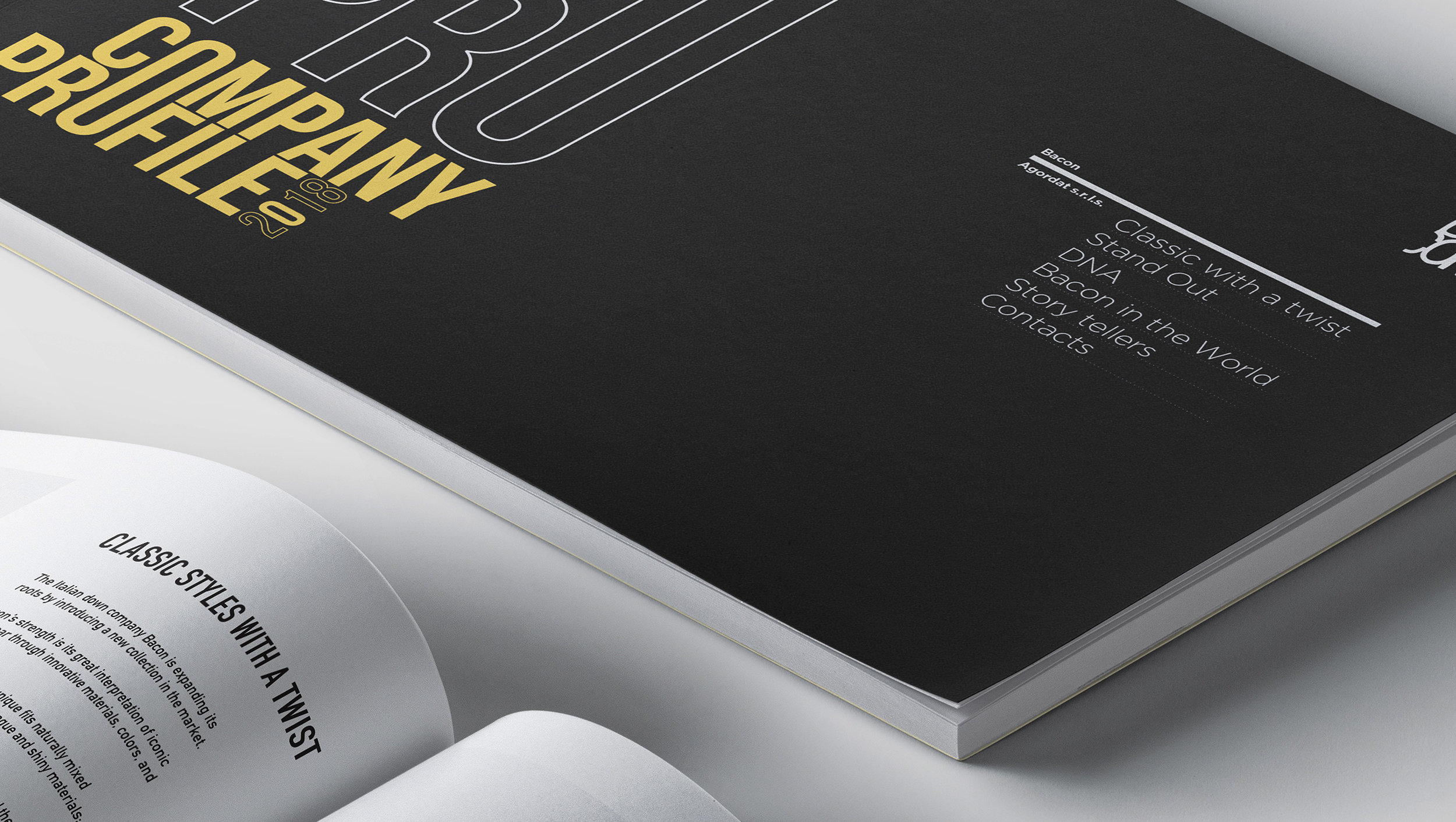
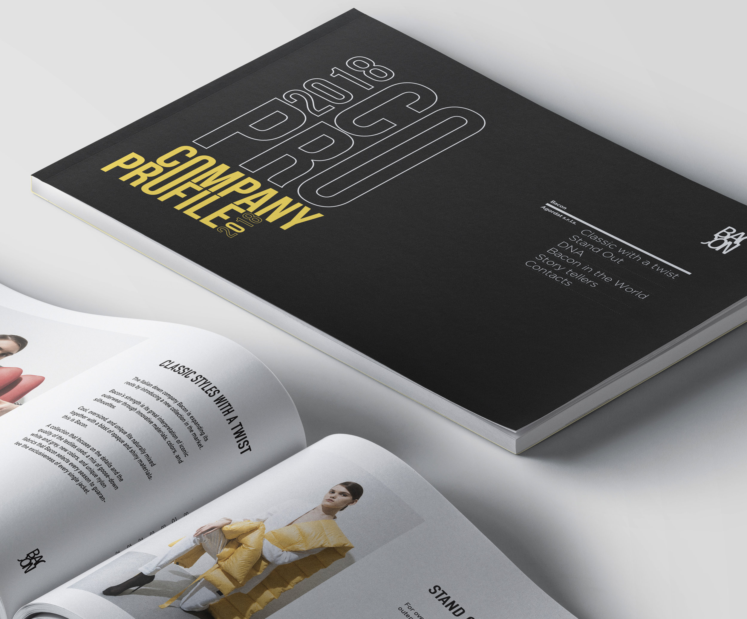
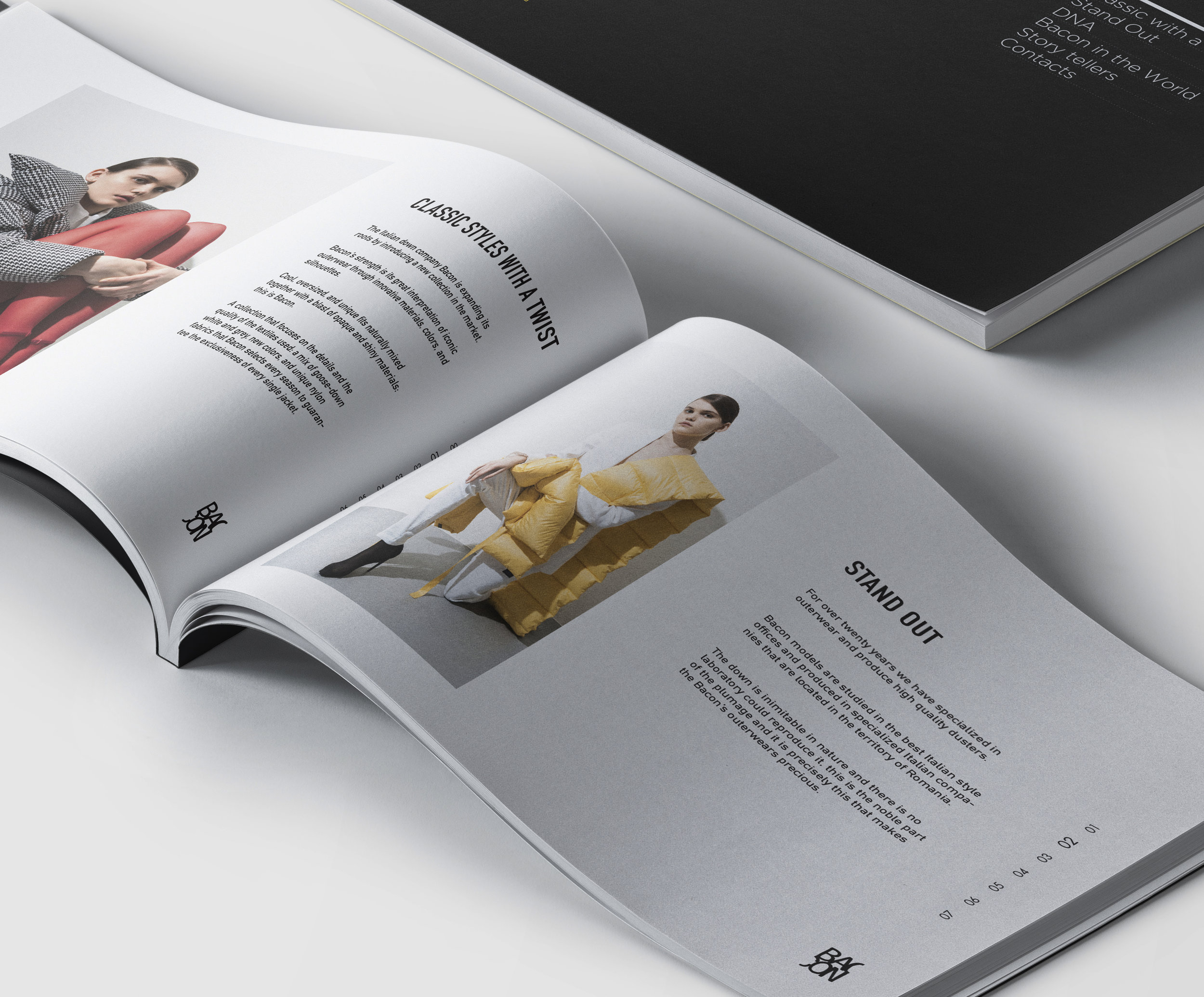
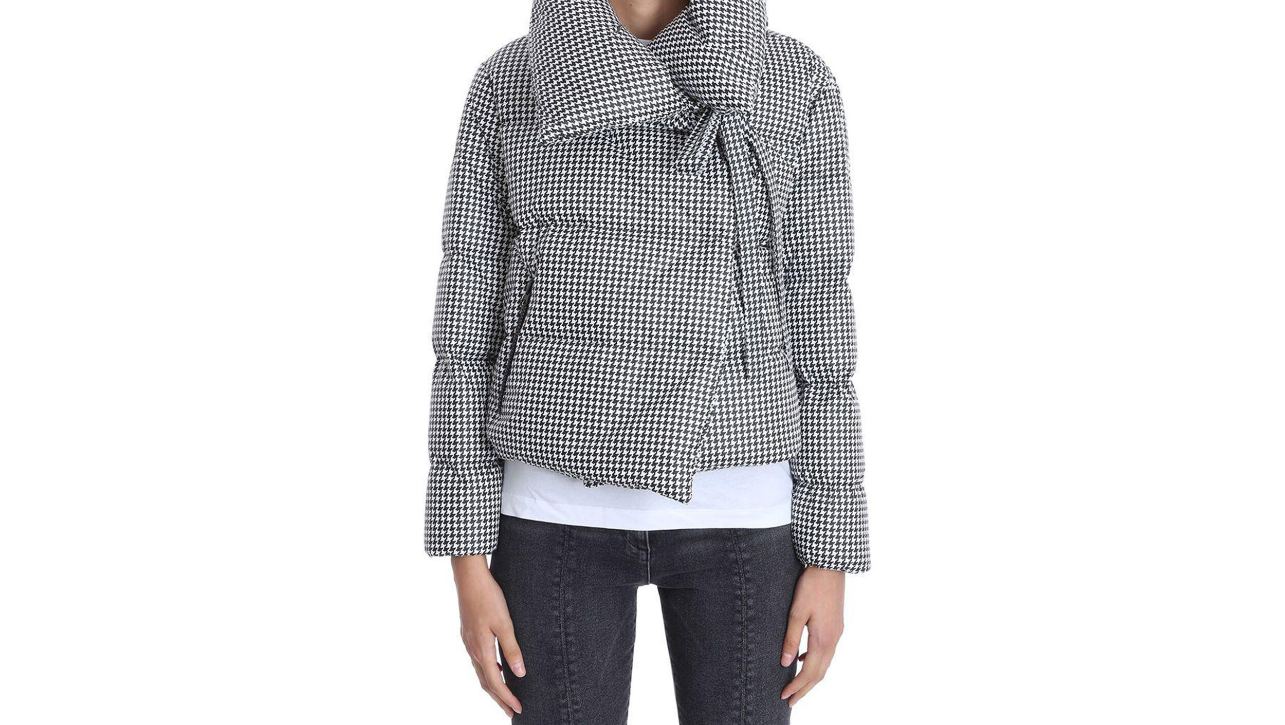
Bacon clothing
Re-Branding, Art Direction, Print design
08
WORLDWIDE CLOTH. BRAND
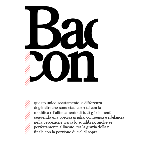

Bacon clothing è un brand italiano presente da anni nello scenario della moda internazionale. Numerosi influencer si prestano alla diffusione di questo marchio che, per la necessità e l’intento di introdursi nell’alta moda / matenendo un tocco “sportivo”, mi ha chiesto di lavorare al Rebranding del marchio seguendo proprio questa direzione. Precedentemente ho realizzato il Company Profile.
KEYWORDS: FASHION, MADE IN ITALY, COUTURE
WHERE: MILAN, ITA YEAR: 2019
Bacon clothing is an Italian brand that has been on the international fashion scene for years. Numerous influencers lend themselves to the diffusion of this brand which, due to the need and intent to enter high fashion / with a "sporty" touch, has asked me to work on rebranding the brand following precisely this direction. Previously I made the Company Profile.
WHERE YOU CAN FIND IT: Barneys - New York • Tsum - RussiA • Harvey Nichols - Hong Kong • United Arrows - Tokyo • Isetan - Japan • Beaker Samsung - Korea • Boon the shop - Korea • VIN STYLE - Dortmund • Nordstorm - Toronto • Vakkorama- Istanbul • Gio Moretti - Milan • Gaudenzi - Riccione • Eraldo - Ceggia (VE) • Deliberti - Naples • Coltorti - Pescara • Gio Moretti - Milan• Gaudenzi - Riccione • Eraldo - Ceggia (VE) • Deliberti - Naples • Coltorti - Pescara • Excelsior – Milano and many other…

202 Hamburger
Print Design, Billboard
WE LOVE HAMBURGER!
Burger, zuppa e cupcake al bancone di un locale in stile americano con mattoni a vista e decorazioni vintage. Ibmoca ha realizzato i nuovi menu e cartelloni pubblicitari per il ristorante 202 di Ibiza.
KEYWORDS: BRANDING | FOOD | HAMBURGER | AMERICANFOOD
WHERE: ibiza, es YEAR: 2017
Burger, soup and cupcake at the counter of a US-style room with exposed brick and vintage decorations. I realized new Menu and Billboards for 202 Ibiza restaurant.
09


CARRER DEL BISBE ABAD LASIERRA 34 07800 IBIZA, SPAIN
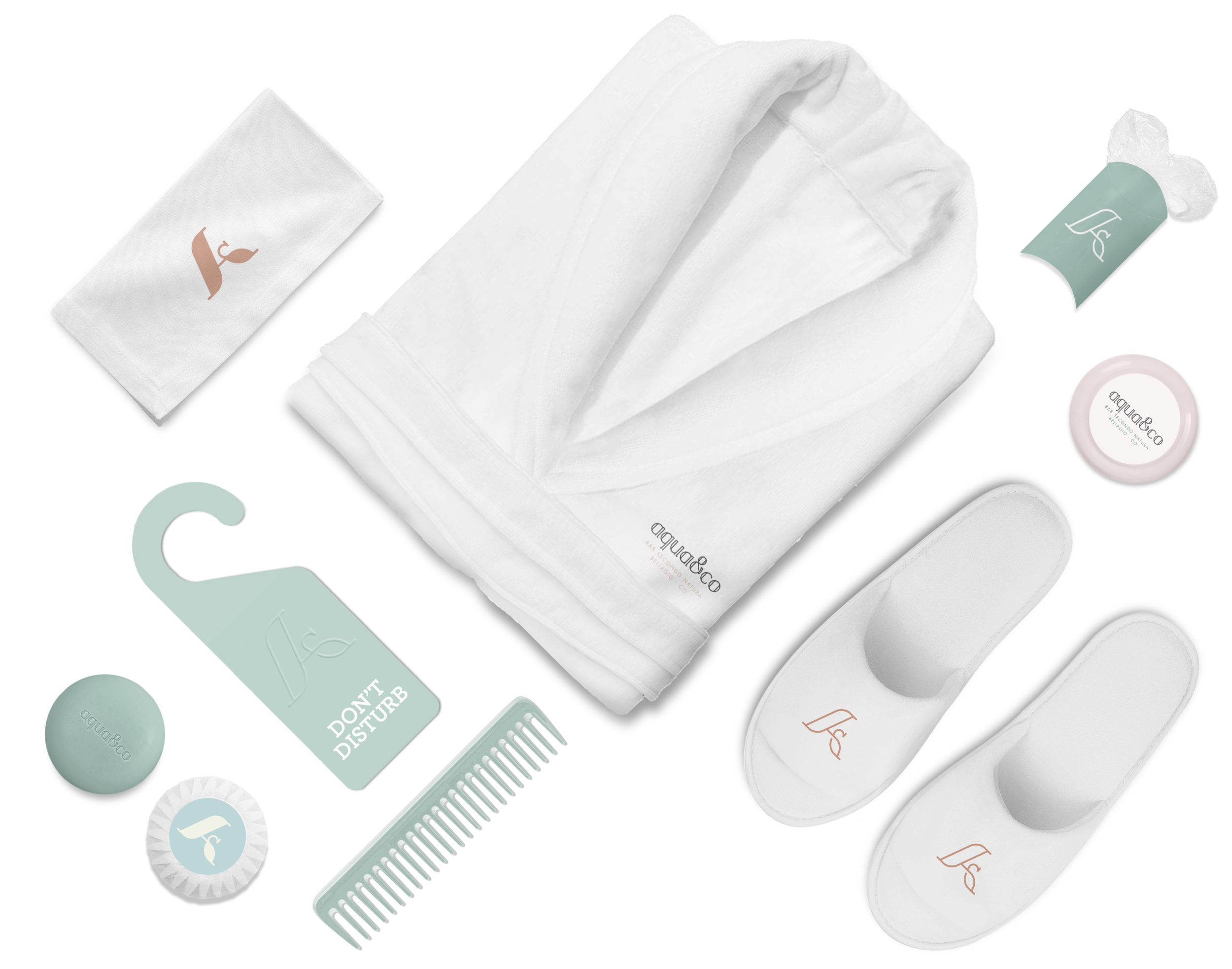
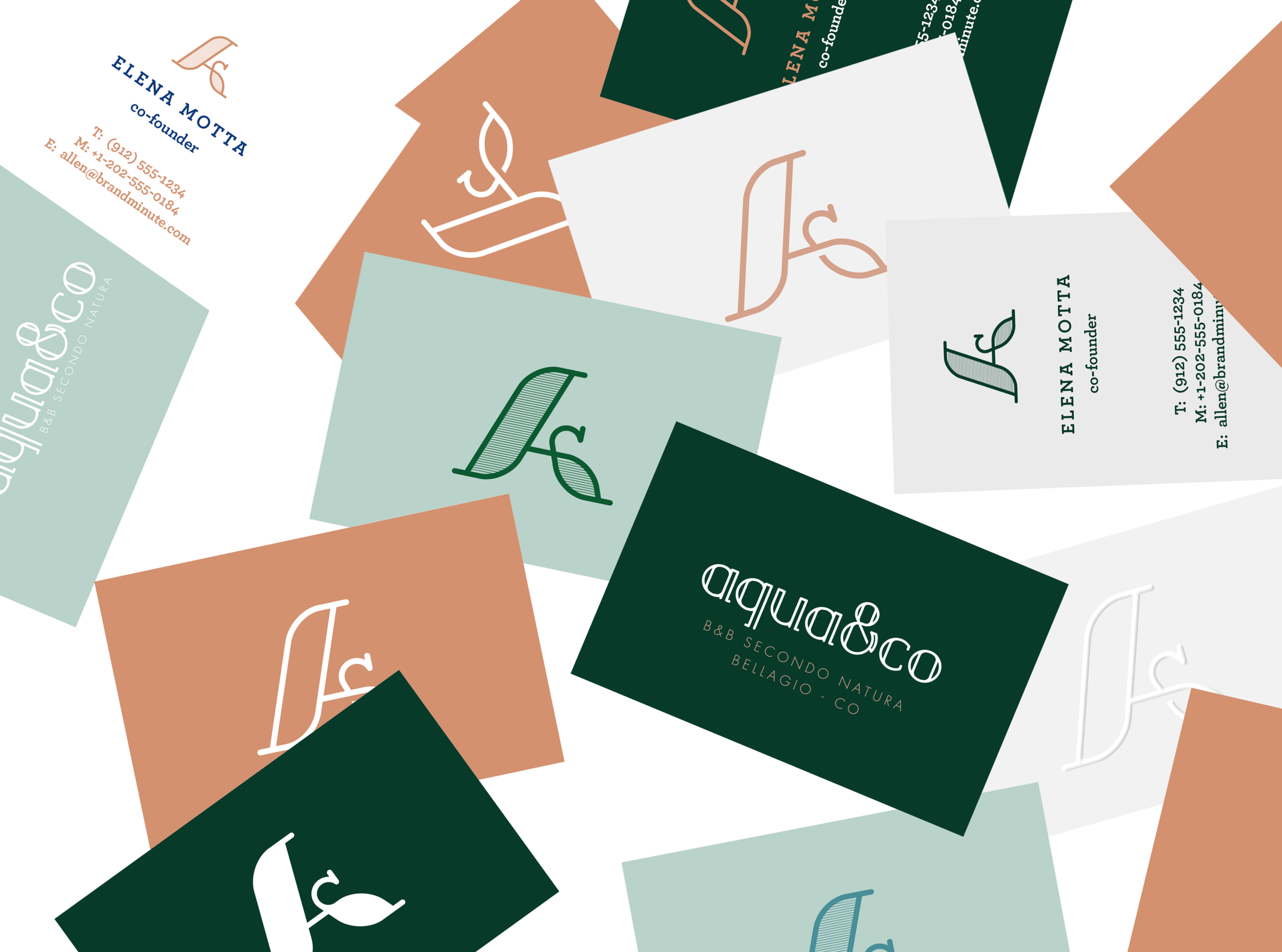
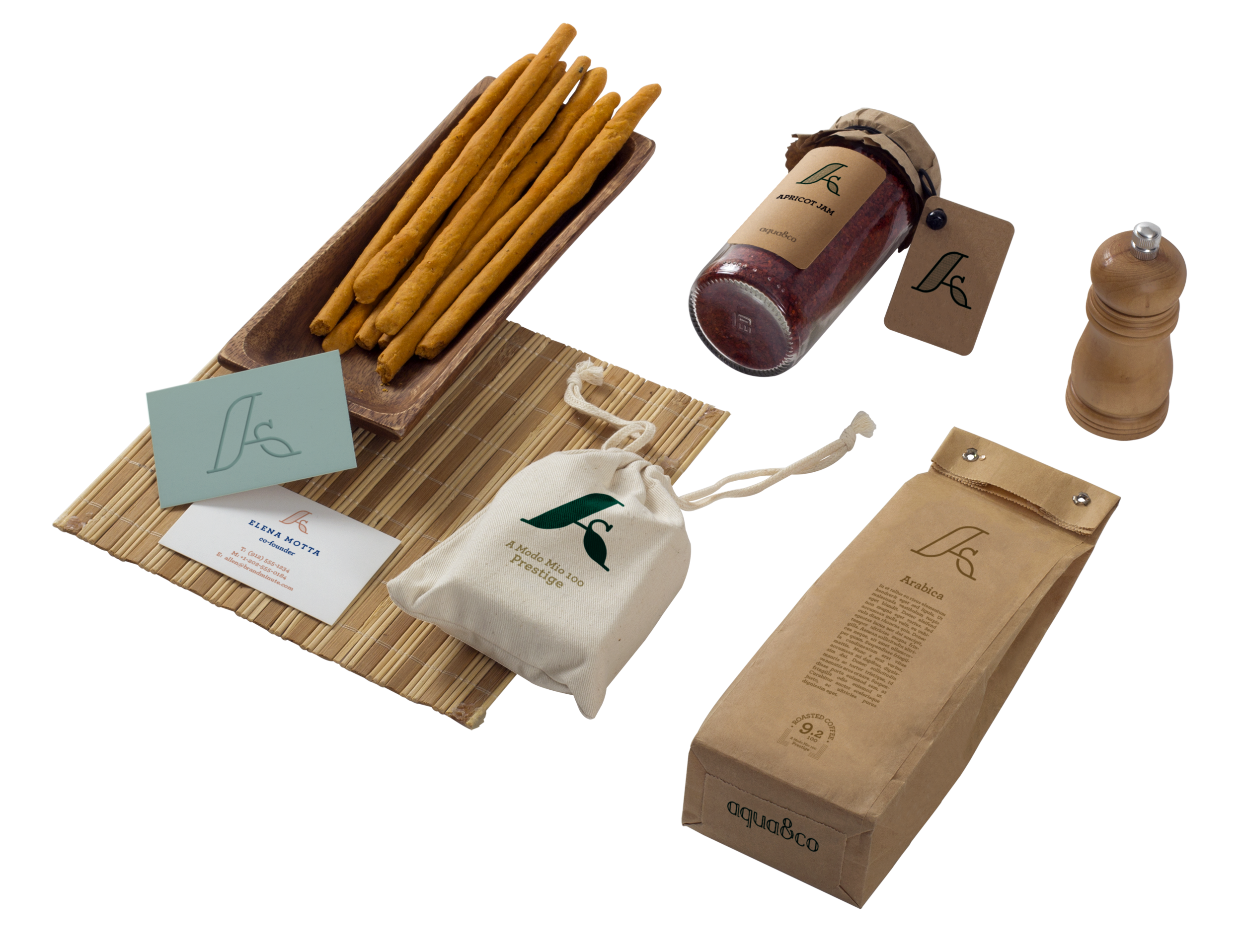
Aqua&co
Logo Design, Custom Typography, Art Direction, Merch
10
B&B SECONDO NATURA


Lo studio del logo di Aqua&co. , sin dalla prima fase di bozza, inizia dal concetto su cui si basa l’idea di Elena, Francesco e Giacomo ovvero quella di creare un brand nel settore del turismo sostenibile capace col tempo di emergere tra gli altri per cura, attenzione e qualità.
Altro punto fermo nella progettazione dell’identità visiva di aqua&co. è il target di riferimento a cui i proprietari intendono rivolgersi:
• ceto medio/alto
• sia italiano che straniero (proveniente perlopiù da nord europa e stati uniti)
per questo abbiamo creato sia un monogramma che un lettering ad hoc dalle linee morbide. Monogramma e nome possono viaggiare indipendentemente l’uno dall’altro, mantenendo l’armonia e l’eleganza delle loro curve.
WHERE: BELLAGIO, CO YEAR: 2018 designed for: bold.
VISIT SITE POWERED BY BOLD.
The study of the Aqua & co logo , from the first draft phase, starts from the concept on which the idea of Elena, Francesco and Giacomo is based, namely to create a brand in the sustainable tourism sector capable of emerging over time, among others, for care, attention and quality.
“Desideriamo diventare realtà di riferimento per cura, attenzione e qualità e speriamo che il concetto di ecologia e sostenibilità diventi uno stile di vita per sempre più persone.
Vorremmo che il nostro modello di semplicità diventasse un esempio per il turismo sostenibile e per il benessere e comfort dell’ospite inteso come compagno di viaggio.”

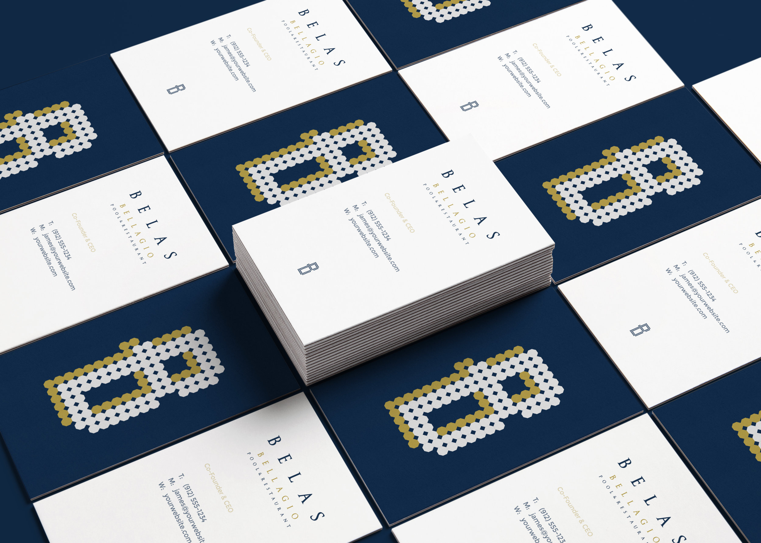
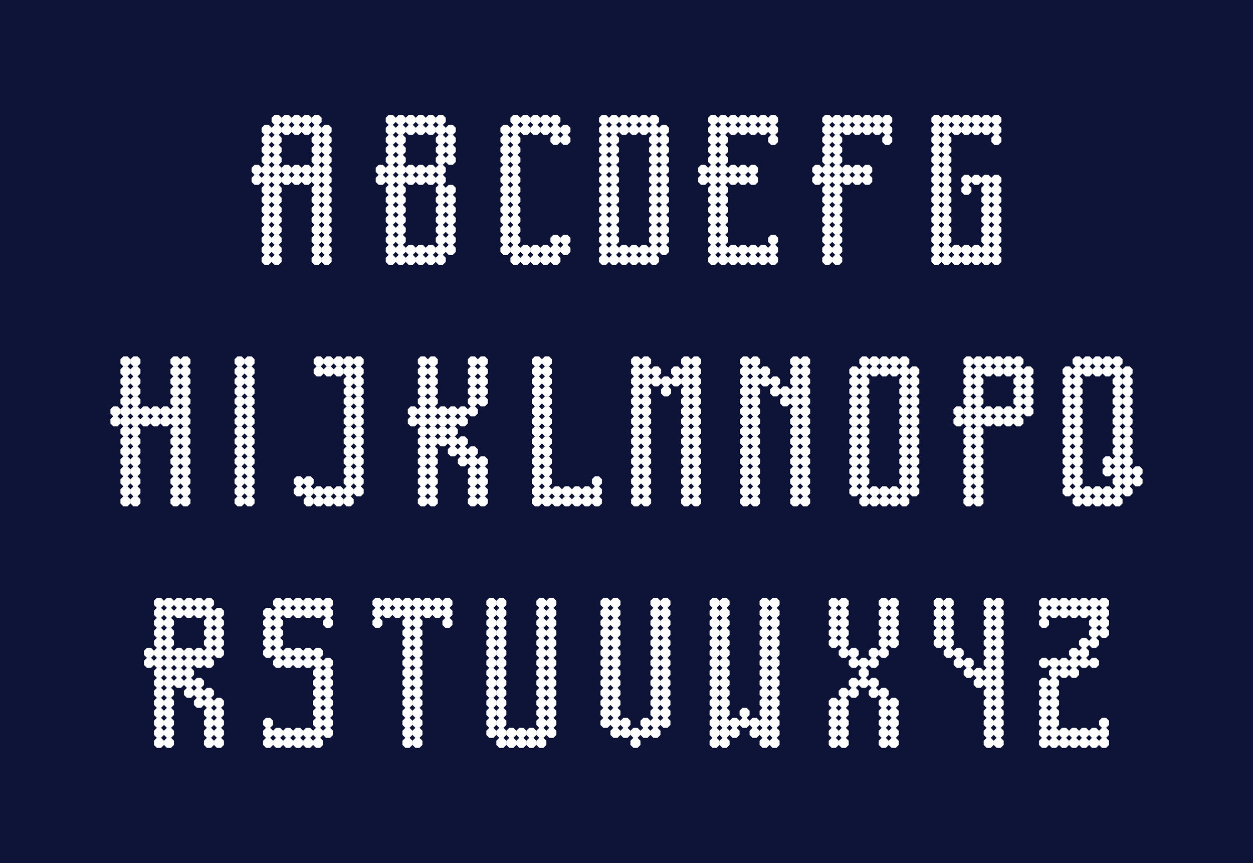
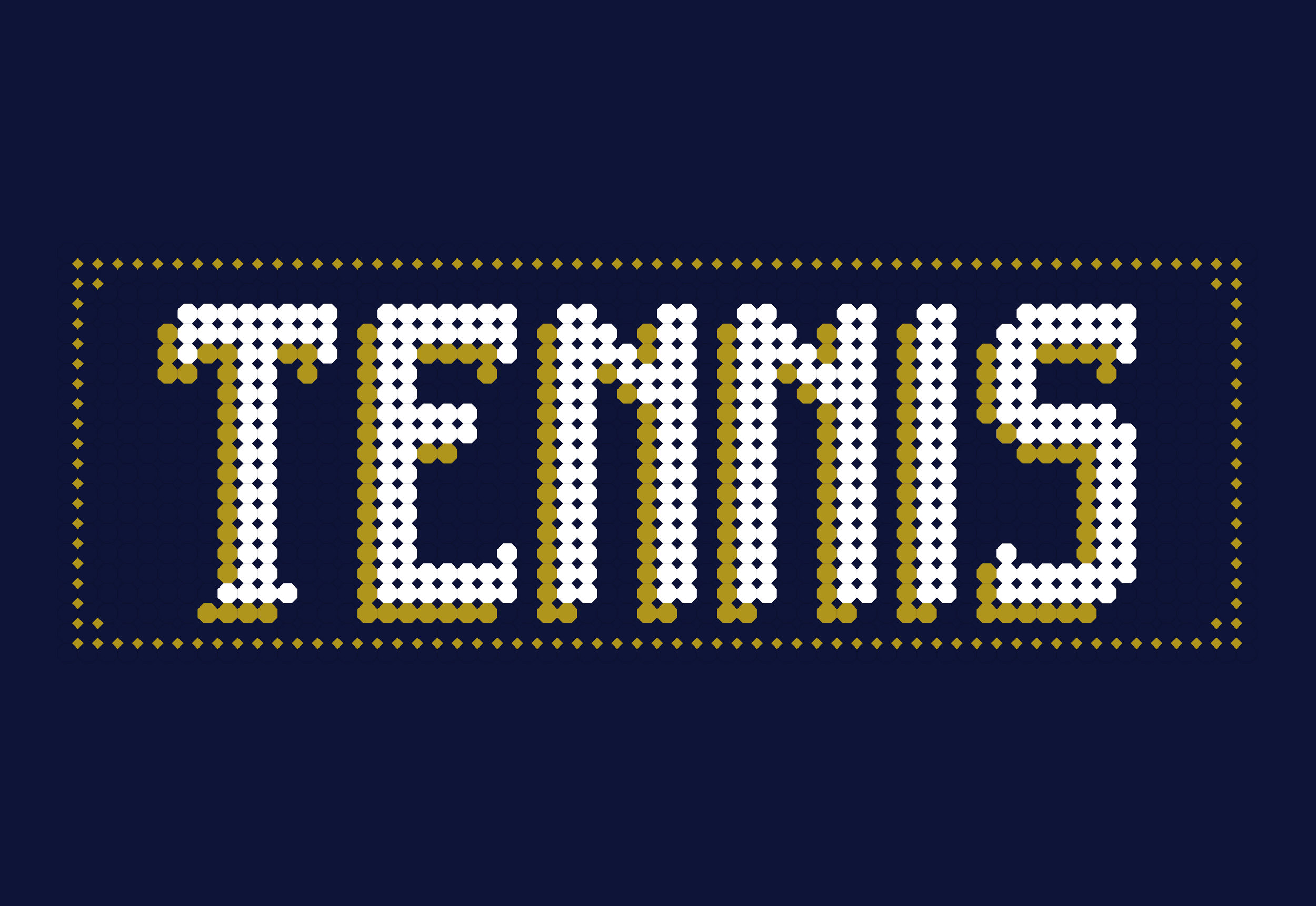
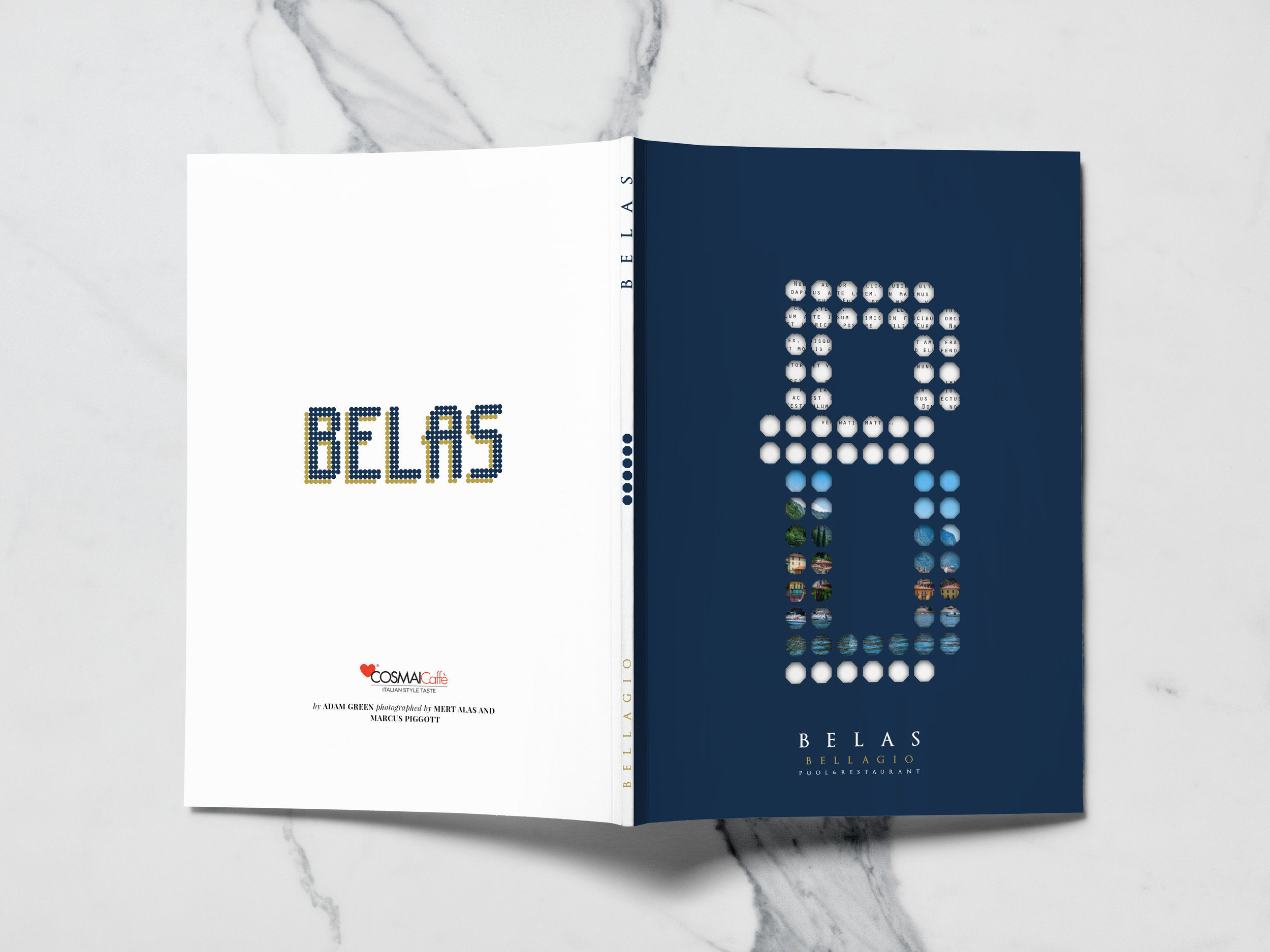
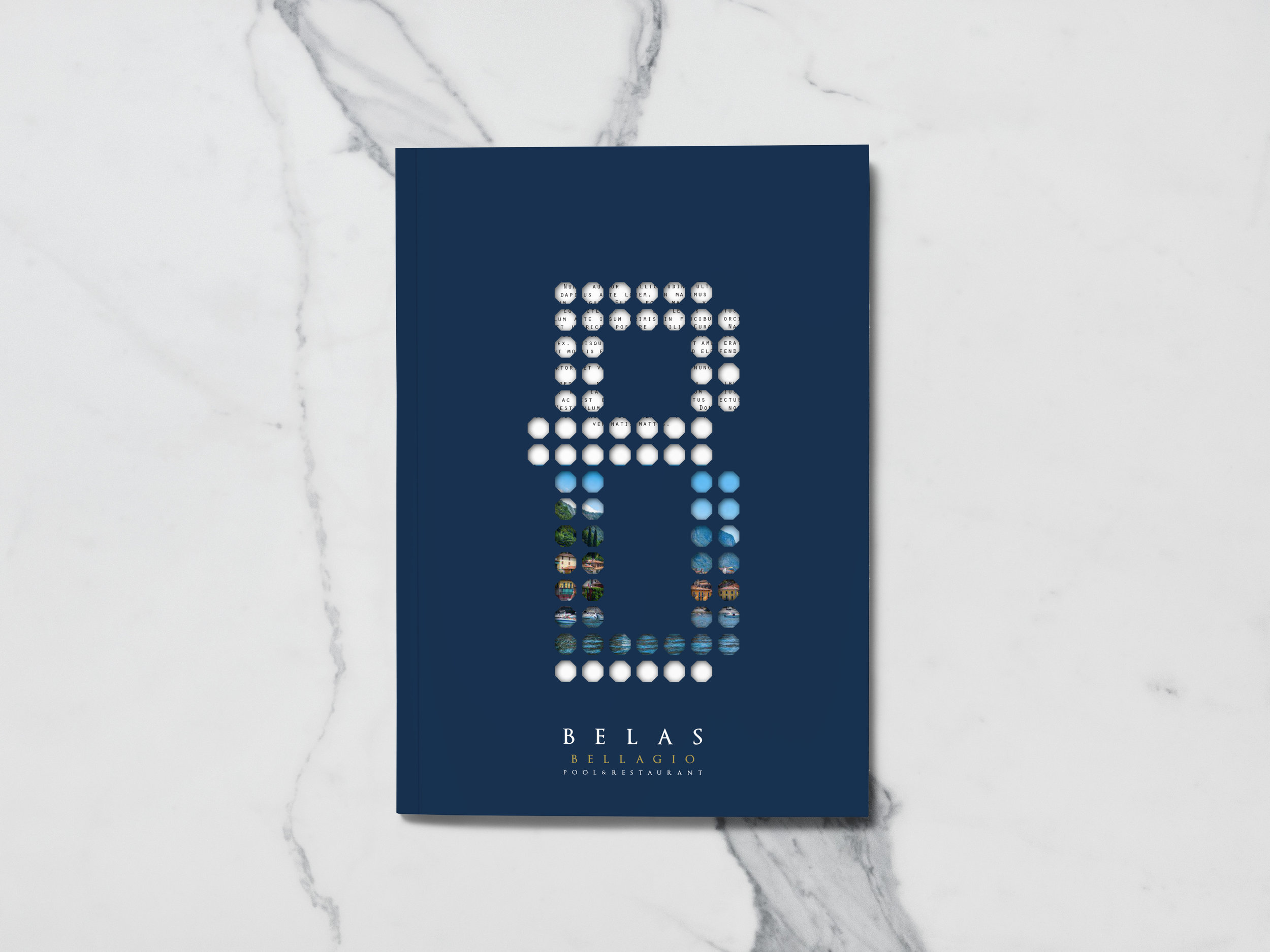
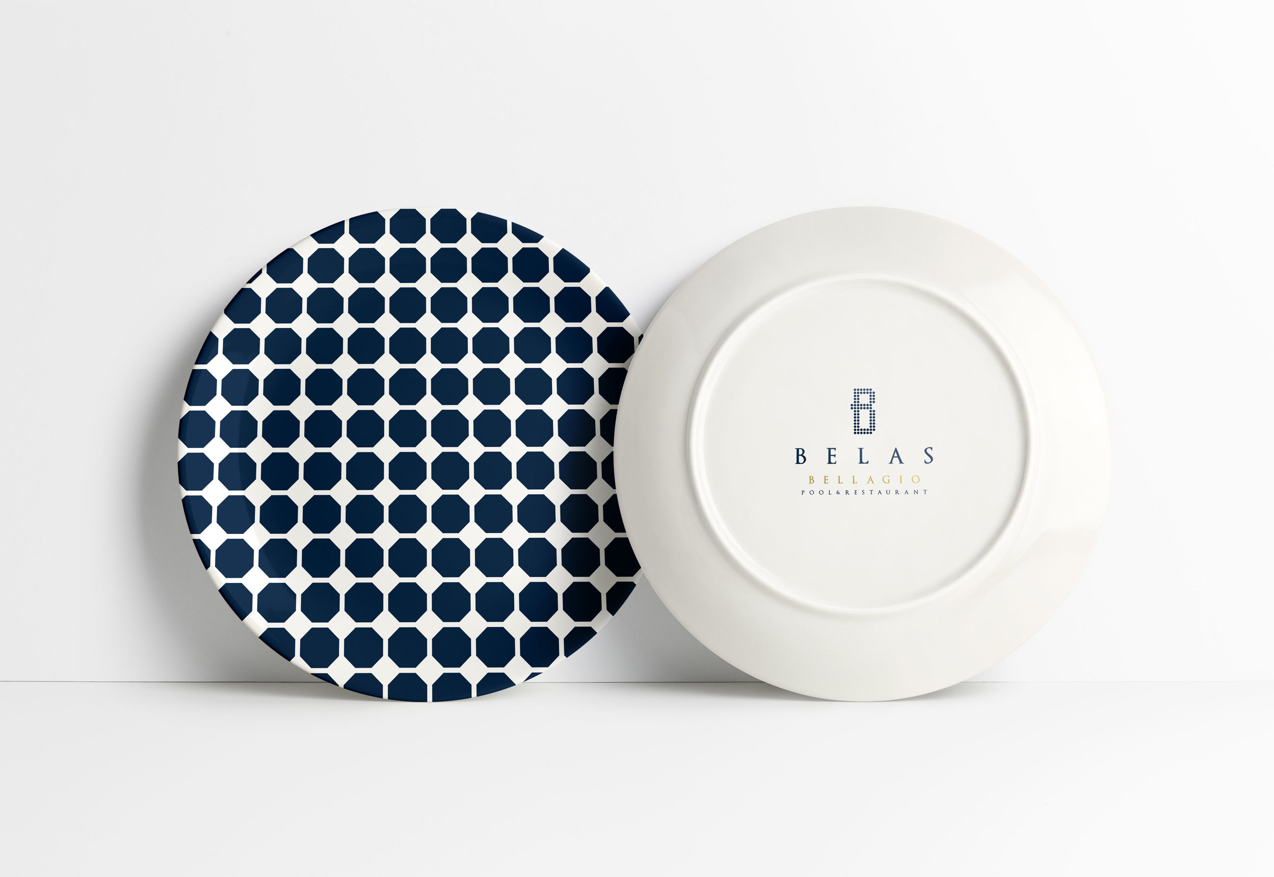
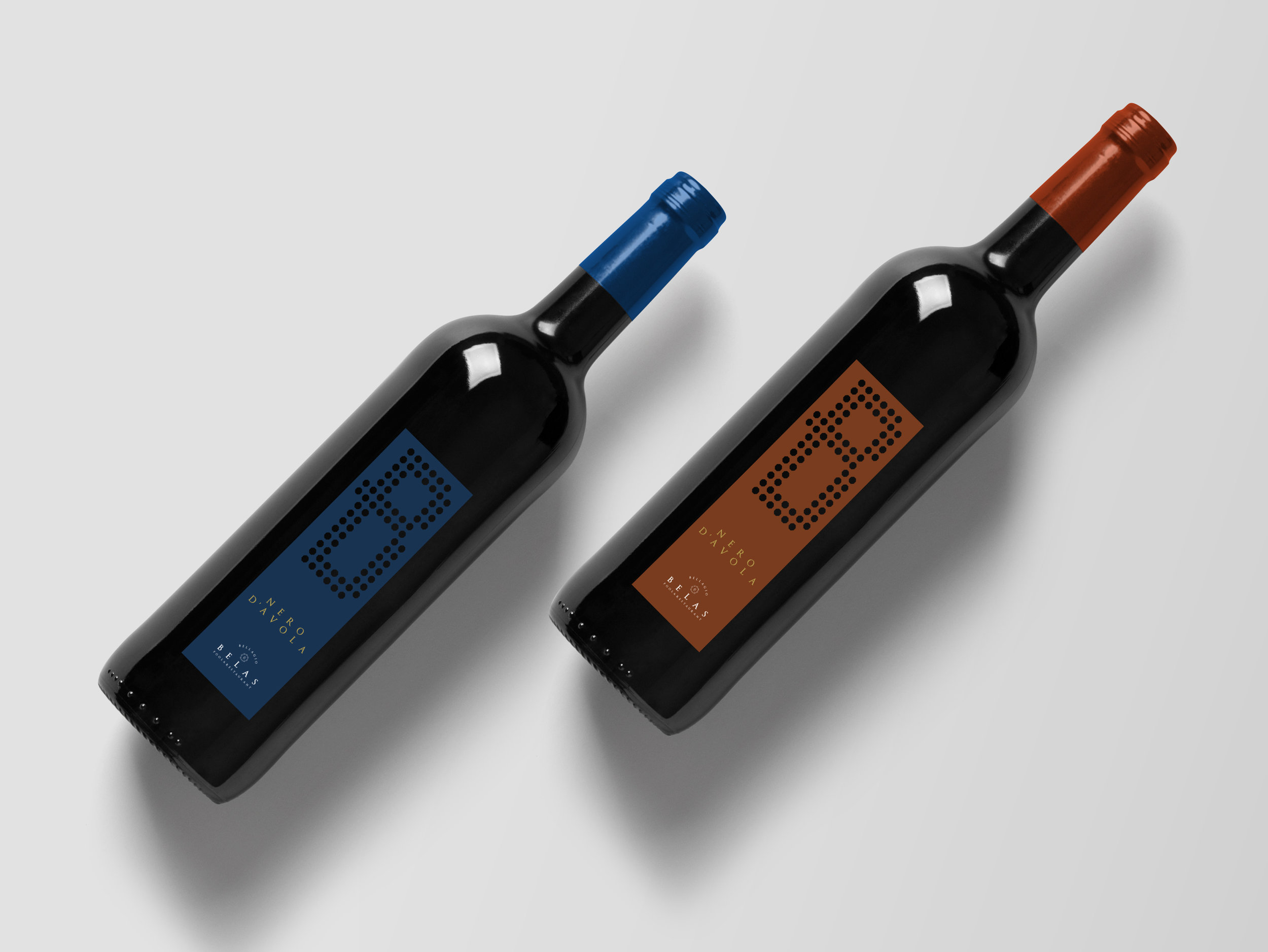
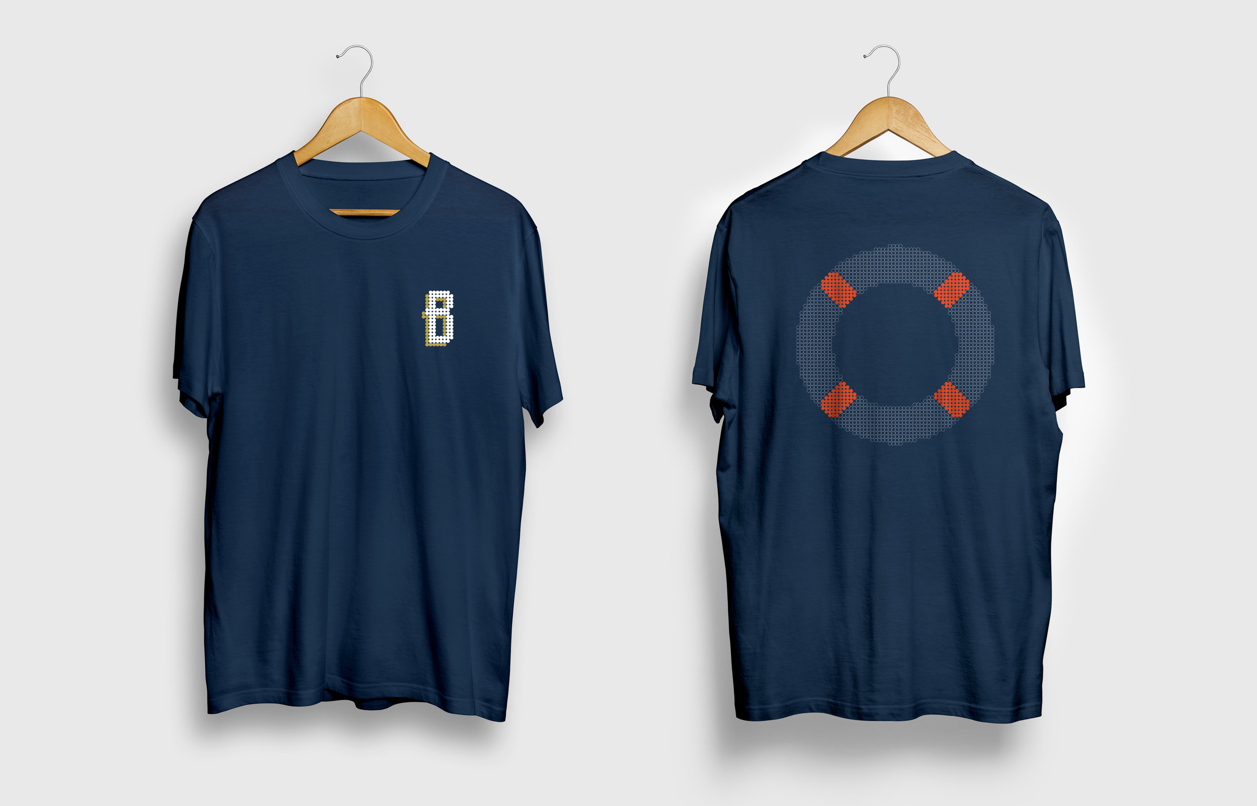
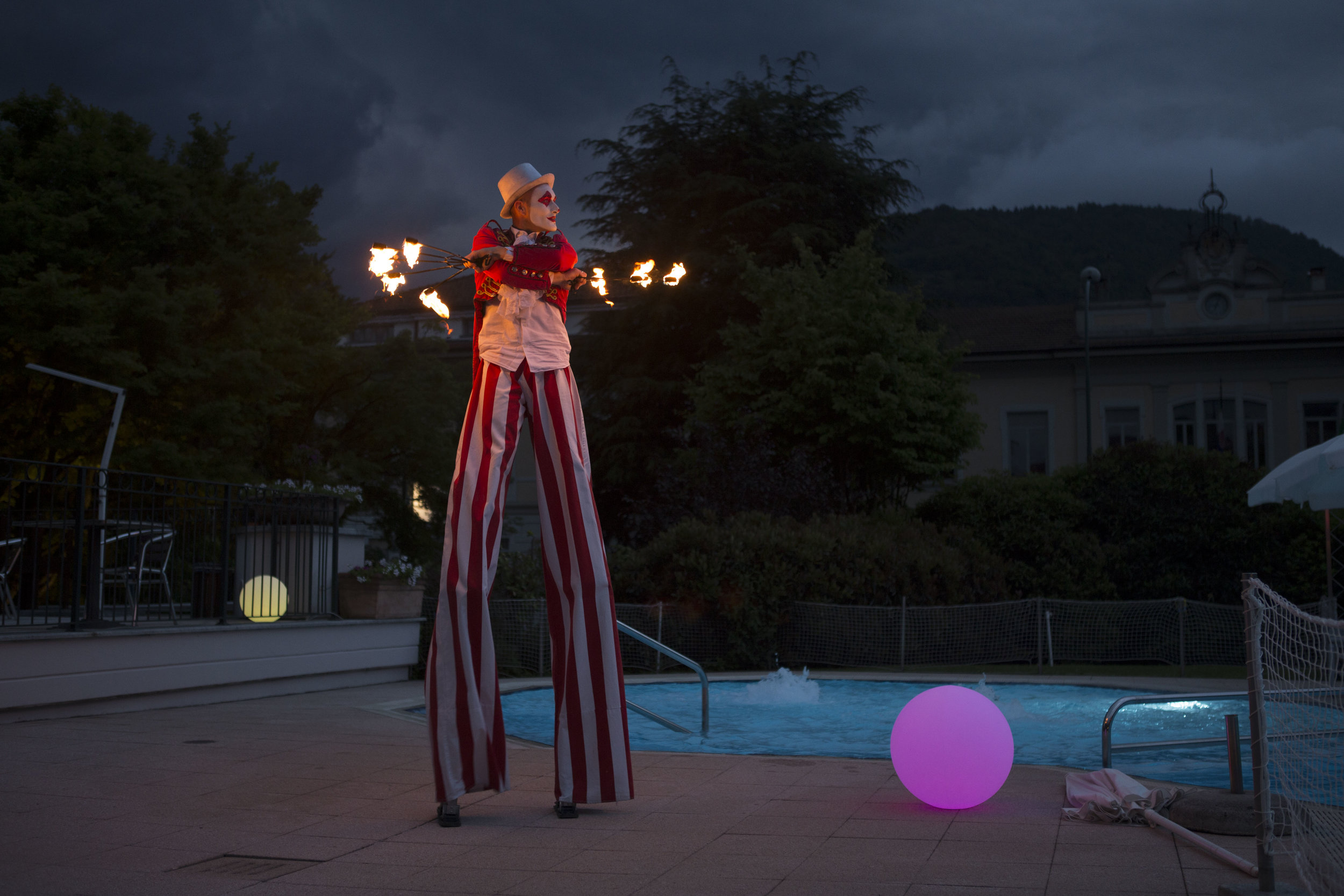
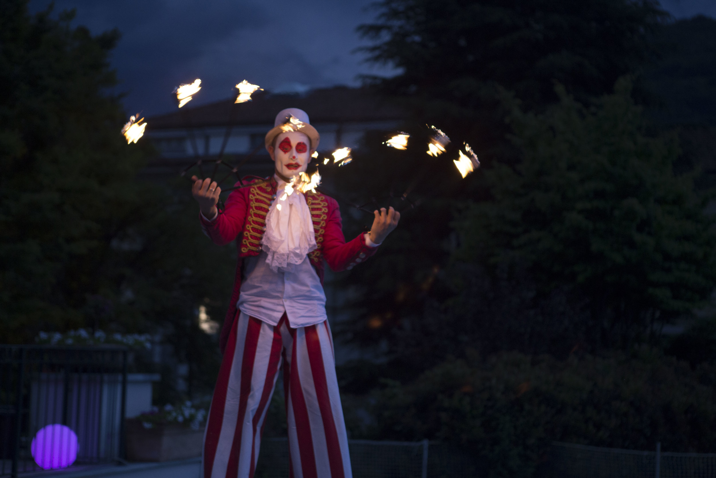
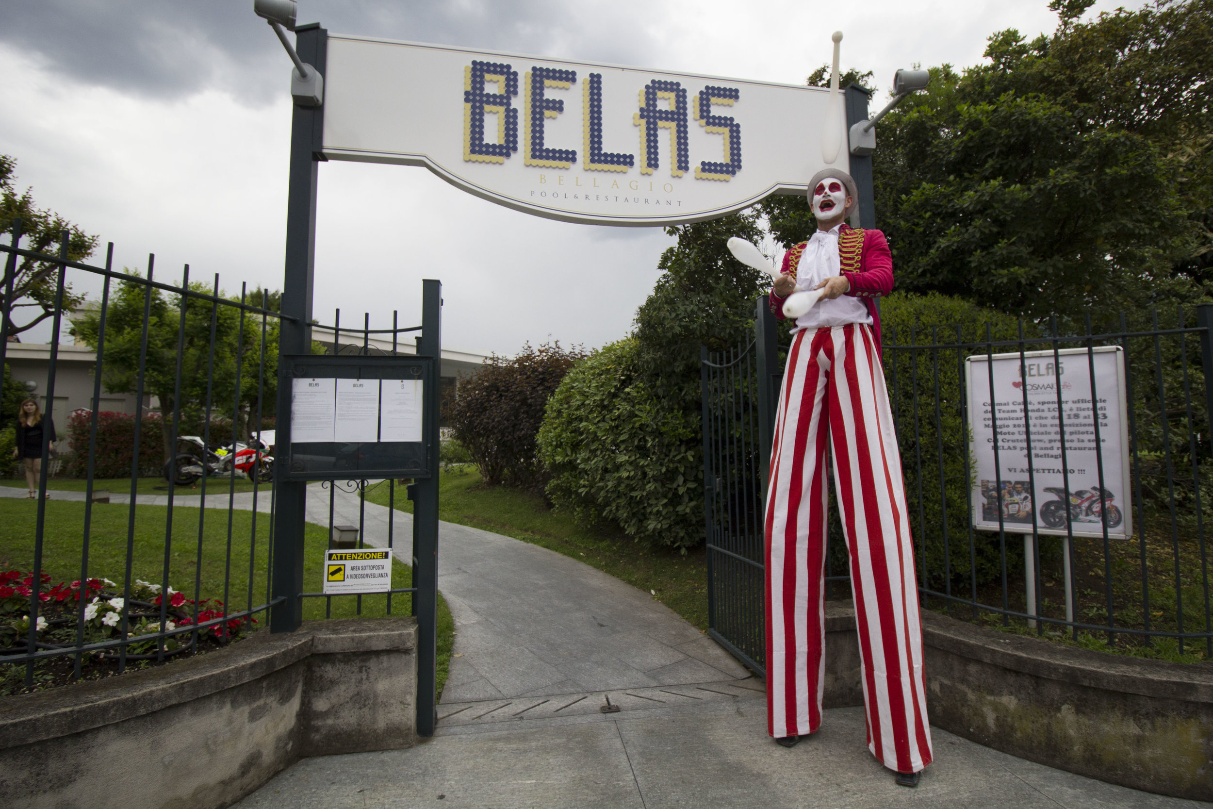
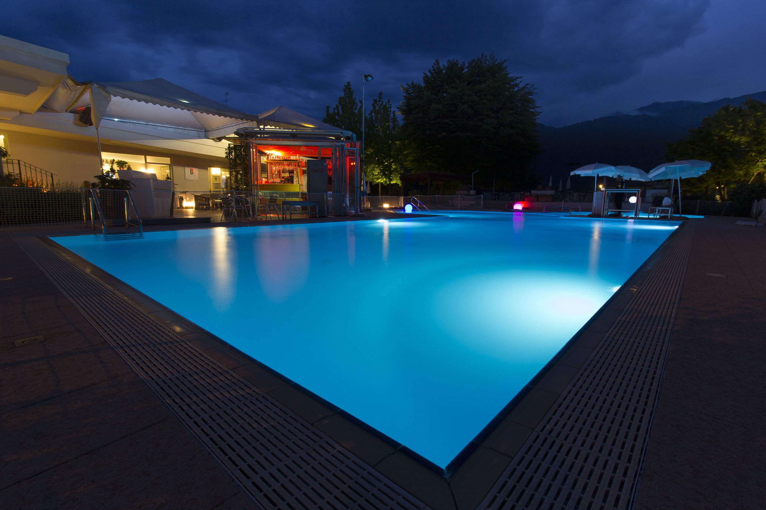
Belas
Logo Design, Art Direction, Print design
11
POOL & RESTAURANT

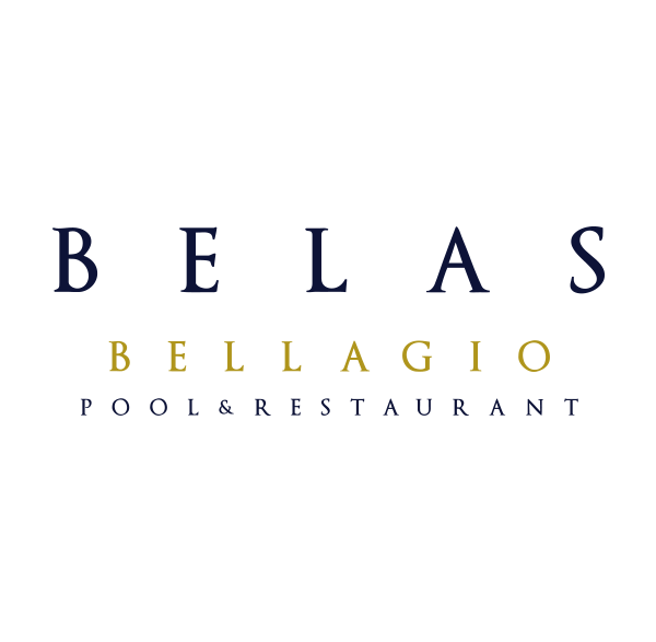
Esclusivo “Club” nel centro di Bellagio, la perla del lago di Como.
Elegante ristorante che offre un menu di pesce di mare (unico nella zona), piscine, solarium, campi da tennis, lounge bar e location per eventi.
Un mix dell’ospitalità all’italiana volta ad un’esigente pubblico internazionale.
KEYWORDS: RESTAURANT, LAKE, CLUB, POOL
WHERE: bellagio, co YEAR: 2018 designed for: bold.
Exclusive "Club" in the center of Bellagio, the pearl of Lake Como. AN Elegant restaurant offering a seafood menu (unique in the area), swimming pools, solarium, tennis courts, lounge bar and event location.
A mix of Italian hospitality aimed at a demanding international public.
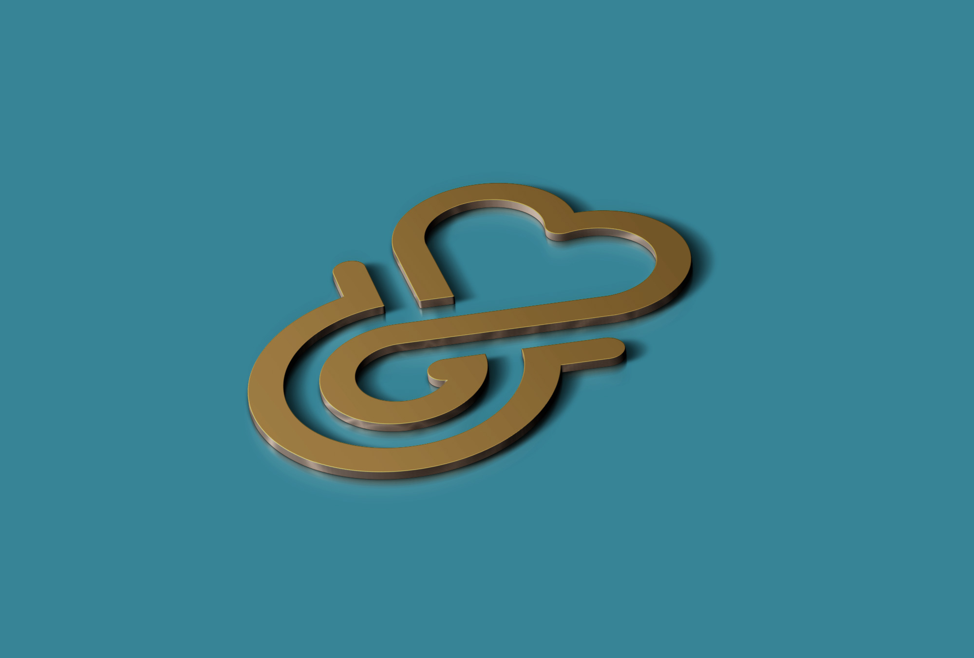
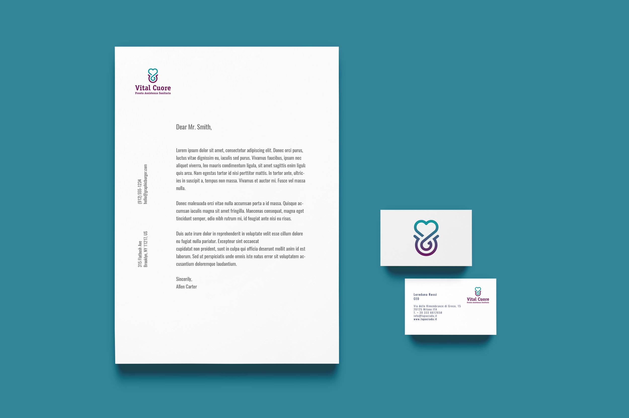
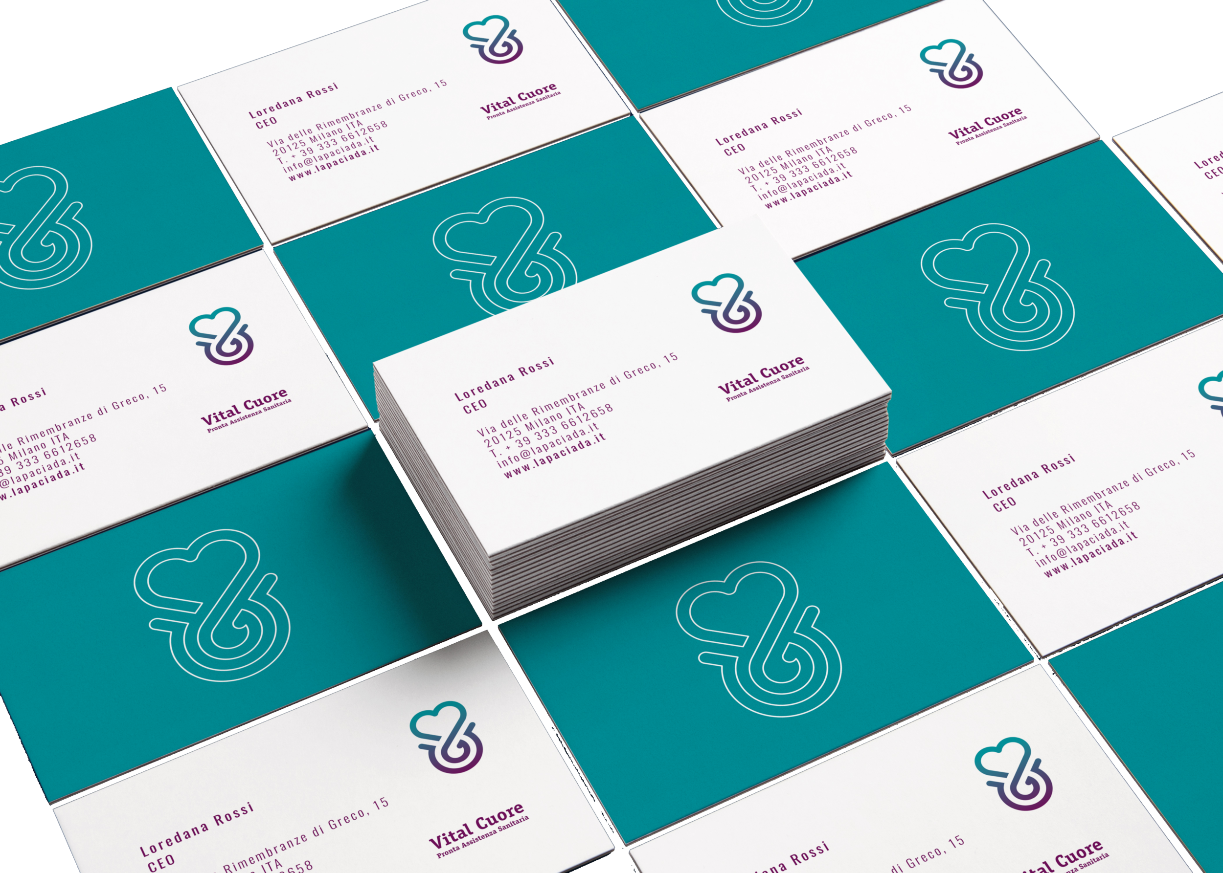
Vital Cuore
Logo Design
12
PRONTA ASSISTENZA SANITARIA


In seguito a uno studio del brief abbiamo identificato l’approccio secondo noi più corretto al rebranding di Vital Cuore. Ci siamo concentrati infatti sul target a cui si rivolge la società. E’ vero che offrono un servizio professionale e altamente qualificato per lo più ad anziani ma la ricerca e la scelta spetta per lo più ai figli e nipoti (benestanti) dei pazienti stessi.
WHERE: MILAN • ITA YEAR: 2019 designed for: bold.
Following a brief study, we identified the most correct approach to rebranding Vital Cuore in our opinion. In fact, we focused on the target the company is targeting. It is true that they offer a professional and highly qualified service, mostly to the elderly, but the research and the choice is mostly for the children and grandchildren (wealthy) of the patients themselves.
“L’amore per la tua famiglia è a cura nostra”


HERE OTHER CUSTOMERS FOR WHICH WE WORKED OR WE ARE WORKING ON
Mr&Mrs Fragrance, Car&vintage, Officina Ventura 14, AIPB at Borsa Italiana, Bit for Cash, SmeUP, Cominder, California Bakery, Birrificio La Ribalta, Love in Verona, Tiablo Comunicazione, Identità Olfattiva, Michele Alebardi climb coach, Pray for Us, Senza clothing, Tapas de Pescado, Ajo Blanco

Back to
Home
